 blog
blog
Classic Art Prints for Office Spaces: A 2026 Guide
Table of Contents
- Why Classic Art Prints Belong in Modern Office Spaces
- Professional Office Wall Decor Ideas That Actually Work
- Top Classic Art Print Styles for a Professional Environment
- How to Frame Vintage Art Prints for a Contemporary Office
- Ergonomic and Lighting Considerations for Art Placement
- Psychological Impact of Art Styles on Focus and Productivity
- Art Maintenance in High-Traffic Office Environments
- Conclusion
- Frequently Asked Questions
Last Updated: September 22, 2026
Why Classic Art Prints Belong in Modern Office Spaces
The global wall art market hit $70.94 billion in 2026, according to Fortune Business Insights' market projection, and it's climbing toward $145.49 billion by 2034. That growth isn't happening in living rooms alone. Offices are driving a meaningful share of it.
Professional Office Wall Decor Ideas That Actually Work
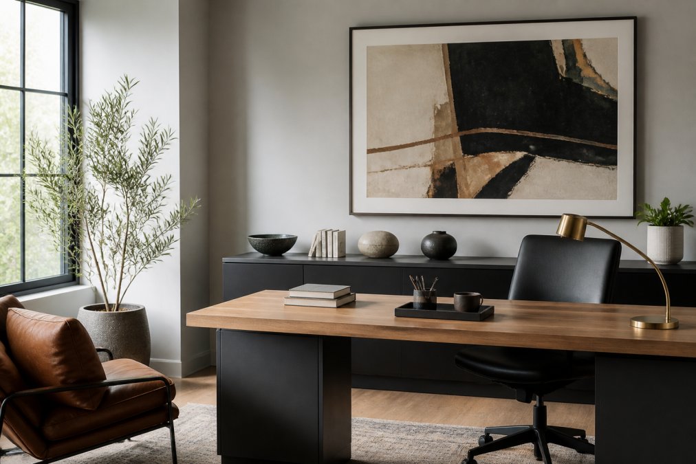
The 70/30 Rule for Visual Balance
Fill roughly 70% of a wall's visual weight with neutral or quiet pieces, and reserve 30% for one bold statement. That ratio keeps a room from feeling cluttered or empty. In practice, it means a large neutral abstract paired with a smaller, higher-contrast print nearby.
Choosing Art by Office Size and Layout
Small offices benefit from one oversized piece rather than several small ones. Open floor plans need art placed at eye level along walking paths, not tucked behind monitors. Private offices can support a more layered arrangement since there's less foot traffic to work around.
Top Classic Art Print Styles for a Professional Environment
Minimalist abstract, nature-inspired photography, and geometric prints are the top-selling wall art styles in commercial spaces, according to Trowbridge Gallery's trade insights. Those three categories cover most office needs, but the details matter.
Minimalist Abstract and Geometric Prints
These styles work because they don't compete with the room. A restrained color palette reads as professional without feeling cold. For 2026, design guidance favors classic cityscapes, architectural prints, and sophisticated abstracts with controlled color, according to Jessie's Home's office art guide.
Nature-Inspired Photography and Cityscapes
Large-scale nature photography remains a staple for professional workspaces, often paired with a single accent color, according to Frameology's office inspiration guide. Cityscapes offer the same calm structure with a bit more narrative.
| Style | Best For | Color Approach | Where to Hang |
|---|---|---|---|
| Minimalist abstract | Reception, open offices | Neutral, low contrast | Main sightlines |
| Geometric prints | Hallways, meeting rooms | One accent color | Eye-level corridors |
| Nature photography | Private offices, focus rooms | Green, blue, earth tones | Behind the desk |
| Cityscapes | Conference rooms | Muted grays, warm accents | Long walls |
How to Frame Vintage Art Prints for a Contemporary Office
Framing decides whether a print reads as dated or deliberate. The print itself is only half the equation, and in an office, the frame has to survive fluorescent light, HVAC dust, and the occasional bumped chair.
Custom Framing vs. Gallery-Wrapped Canvas
Custom framing gives you control over mat width, glazing, and finish, which matters for archival or vintage pieces. Gallery-wrapped canvas skips the frame entirely and suits modern, minimal interiors. Neither is universally better. Canvas feels lighter in small rooms; framed prints feel more formal in client-facing spaces.
The practical trade-offs are worth spelling out:
- Mat width. A 2- to 3-inch mat is the standard for a professional look. Wider mats (4 inches and up) push a small print toward gallery scale but require a larger frame, which raises cost and wall footprint.
- Glazing. Standard glass is cheapest but reflects overhead lights. Anti-reflective glass cuts glare at the cost of slight color warmth. Acrylic (often called Plexiglas) is lighter and shatter-resistant, a real advantage in hallways and reception areas where a bumped frame is a liability.
- UV protection. If a print sits anywhere near a window, UV-filtering glazing or acrylic is the single highest-value upgrade. It won't stop all fading, but it slows the process dramatically compared to bare glass.
- Frame finish. Metal frames (aluminum, steel) read contemporary and pair well with glass-and-steel offices. Wood frames read warmer and suit traditional or transitional spaces.
Matching Frame to Room, Not to Artwork
A common mistake is framing to the print's dominant color. Instead, match the frame finish to the room's dominant metal, brass, chrome, black, or brushed nickel, and let the mat do the color work. A warm brass frame in a chrome-heavy office will look like a mistake even if the print is perfect.
When Canvas Wins, and When It Doesn't
Gallery-wrapped canvas is the better choice when:
- The wall is large and the budget is tight (no frame or glazing cost).
- The room is casual or creative rather than client-facing.
- The print is a reproduction you may rotate out in a year or two.
Framed prints win when:
- The piece is vintage, signed, or archival.
- The space is formal, client-facing, or a conference room.
- You need glare control under overhead lighting.
Hanging Hardware Matters More Than People Think
A framed 24x36 print with glass and a mat can weigh 10 to 15 pounds. A single nail rated for 5 pounds is a fall waiting to happen. Use two hooks rated for at least twice the frame's weight, spaced a third of the way in from each side, and anchor into a stud whenever possible.
Ergonomic and Lighting Considerations for Art Placement
Hang art at eye level, roughly 57 to 60 inches from the floor to the center of the piece. That's the same standard used for gallery hangs, and it prevents the neck strain that comes from art placed too high.
Psychological Impact of Art Styles on Focus and Productivity
Calm, structured imagery tends to support concentration, while busy, high-contrast pieces can pull attention away from work. That's not a hard rule, but it's a useful starting point, and the reason has more to do with cognitive load than with taste.
Why Some Art Helps Focus and Some Hurts It
The mechanism is fairly simple. The brain has a limited budget for visual processing. Art that is visually complex, many colors, dense detail, high contrast, strong diagonal movement, competes for that budget every time the eye lands on it. Art that is visually quiet, limited palette, low contrast, simple composition, gives the eye a place to rest without demanding anything back.
Abstract vs. Representational: A Practical Distinction
Most practitioners find that:
- Abstract work supports open-ended thinking and creative tasks. It doesn't tell the viewer what to see, so it doesn't compete with whatever the viewer is already thinking about.
- Representational work, landscapes, architecture, portraits, supports orientation and calm. It gives the eye a clear subject, which can be restful in a break area or reception space.
- High-detail work (dense photography, intricate patterns) is best reserved for spaces where people aren't doing sustained cognitive work, hallways, lobbies, transitional areas.
The Ergonomic Angle Most Guides Miss
Placement matters as much as style. Art hung directly behind a monitor forces the viewer to turn or refocus every time they glance up, which adds physical strain on top of the visual load. Art placed in the natural line of sight, slightly to the side of the desk, or on the wall the eye drifts to during a phone call, gets seen without being worked for.
Lighting Changes the Equation
Direct sunlight fades prints over time, so keep pieces out of harsh south-facing glare or use UV-filtering glass. But lighting also affects how the art feels. A piece lit by a warm desk lamp reads differently than the same piece under cool overhead fluorescents. If a print looks flat or harsh in a space, the fix is often a lighting change, not a new print.
The most effective office art isn't the most striking piece on the wall. It's the piece that gives the eye a place to rest without asking for anything in return, and that's a placement and lighting decision as much as a style decision.
Art Maintenance in High-Traffic Office Environments
High-traffic areas punish wall art. Dust, fingerprints, and accidental bumps add up faster than most people expect.
- Dust framed prints with a dry microfiber cloth every two to three weeks
- Avoid liquid cleaners on glass; they can seep behind the frame
- Rotate art away from direct sun exposure seasonally
- Check hanging hardware every few months in hallways and reception areas
Hanging a heavy framed print with a single nail in a hallway is the most common cause of office art damage. Use two hooks rated for twice the frame's weight, or the piece will eventually fall.
Conclusion
The hardest part of decorating an office isn't finding art. It's finding pieces that still feel right two years from now. Runway & Heirloom offers a thoughtfully curated collection of prints inspired by art history, aviation, childhood, nostalgia, personality, and self-expression, with collections spanning Oil Painting Prints, Classic Cars, and Watercolor Art that bring history and personality into a workspace.
Frequently Asked Questions
What are the best classic art prints for a professional office?
The best classic art prints for a professional office balance visual interest with a polished look. Minimalist abstract, nature-inspired photography, and geometric prints are top sellers for commercial spaces, according to Trowbridge Gallery. For a cohesive look, choose a neutral palette and consider the 70/30 rule: 70% of your art should be neutral or subdued, while 30% can be a strategic accent color.
How do you choose art for an office space?
Start by considering the office layout and where art will be most visible. Use the 70/30 rule to balance neutral tones with an accent color, and select pieces that reflect your company culture or brand personality. For professional office wall decor ideas, think about scale: a large piece can anchor a meeting room, while smaller prints work well in hallways. Lighting is key, so avoid placing art where glare will obscure it. Finally, choose frames that complement your existing decor for a cohesive look.
Does classic art improve office productivity?
Yes, research suggests that art in the workplace can boost morale and productivity. Creative Art Partners reports that art transforms sterile office environments into spaces that spark innovation and improve morale. The psychological impact varies by style, but nature-inspired and abstract works often promote calm and focus.
How should I frame classic art prints for a modern office?
For a modern office, choose clean, simple frames that don't compete with the artwork. Thin black or white frames work well for minimalist designs, while natural wood frames add warmth to neutral palettes. Gallery-wrapped canvas prints offer a frameless option that feels contemporary. When learning how to frame vintage art prints, consider archival materials to prevent fading and use UV-protective glass if the art will be in a bright area. Custom framing ensures a perfect fit and a polished look.