 ultimate-guide
Watercolor Wall Art for Any Room: 2026 Guide
Table of Contents
- What Makes Watercolor Wall Art Special for Modern Interiors
- Watercolor Wall Art Styles: Botanical, Abstract, and Landscape Options
- How to Style Watercolor Prints in Different Rooms
- Watercolor Nursery Wall Decor Ideas and Color Coordination
- Framing Tips for Watercolor Art and Preservation
- Color Palettes and Design Trends for 2026
- Matching Watercolor Art to Your Interior Style
- Sustainability and Quality Considerations
- Frequently Asked Questions
Last Updated: September 20, 2026
What Makes Watercolor Wall Art Special for Modern Interiors
Watercolor wall art has become a defining element of contemporary home design, prized for its ability to add emotional depth and warmth to living spaces. According to iCanvas's 2026 Trends Report, wall art in 2026 is increasingly used to add emotional depth, warmth, and personality to modern interiors rather than simply filling space. This shift reflects a broader move away from generic decoration toward pieces that tell a story and resonate with the people who live with them.
Watercolor's fluid, organic nature creates calm and openness across design styles. Its soft color transitions and expressive brushwork bring a human touch that mass-produced prints lack, transforming a room's ambiance with visual texture and artistic integrity.
Watercolor wall art offers an accessible entry point to fine art collecting, with styles ranging from botanical illustrations to abstracts and landscapes. The medium's transparency and layering create depth, making even smaller pieces feel dynamic.
Watercolor Wall Art Styles: Botanical, Abstract, and Landscape Options
Watercolor wall art comes in three primary aesthetic directions, each offering distinct visual and emotional qualities for different rooms and design preferences.
Botanical and Floral Watercolor Prints
Botanical watercolor prints remain among the most popular wall art styles for 2026. According to BuyWallArt.ca's 2026 Market Analysis, neutral abstract canvas prints and botanical themes are among the top-selling wall art styles. These pieces feature detailed renderings of plants, flowers, leaves, and stems, often with scientific precision combined with artistic interpretation.
Botanical art bridges naturalism and abstraction, capturing delicate plant structures while celebrating the medium's fluidity. Pieces range from single-stem studies to dense garden compositions.
For living rooms and bedrooms, botanical prints in earth tones, clay reds, warm ochres, moss greens, and terracotta, create a grounding effect. According to Society6's 2026 Palette Analysis, earth tones, including clay reds, warm ochres, moss greens, and terracotta, are leading watercolor palettes in 2026. These natural hues pair seamlessly with wood furniture, linen textiles, and warm lighting. Nurseries benefit particularly from botanical themes, which introduce children to the natural world while maintaining a soothing visual environment.
Abstract Watercolor Wall Art
Abstract watercolor art offers pure color, form, and movement without representational constraint, using flowing washes and spontaneous brushwork to invite interpretation.
Abstract watercolors excel in minimalist spaces, with single large pieces serving as focal points or smaller series creating gallery walls. Soft palettes, muted blues, warm grays, soft pinks, pale greens, integrate easily into existing color schemes.
Abstract watercolors create space for contemplation, inviting personal interpretation. This makes them particularly effective in bedrooms and home offices, where calm focus matters.
Landscape and Nature-Inspired Watercolors
Landscape watercolors capture scenes, mountains, coastlines, forests, skies, in soft-focus style, emphasizing atmosphere over detail.
Landscape paintings work well in living rooms and entryways. Seascapes in cool blues create openness, while forest scenes bring nature indoors. Mediterranean-inspired artwork, a top-selling 2026 style, features coastal villages and warm-light landscapes evoking travel and leisure.
Scale matters: large landscape pieces anchor a room's design, while smaller studies work in gallery walls or paired arrangements.
How to Style Watercolor Prints in Different Rooms
Successful placement of watercolor wall art depends on understanding how light, room function, and existing décor interact with your chosen pieces.
Living Room and Bedroom Placement
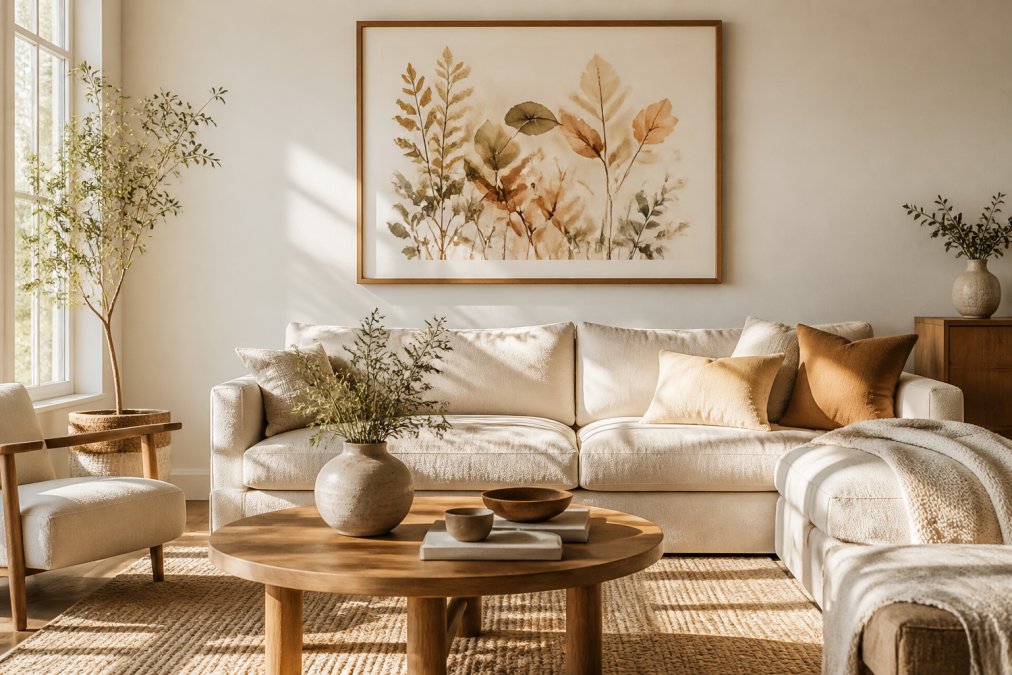
A single large watercolor above the sofa creates a focal point, covering roughly 40-60% of wall space for visual balance. Position in natural or warm artificial light to highlight pigment layers and translucency.
In bedrooms, use soft, muted palettes above or opposite the bed. Avoid harsh direct sunlight, which fades watercolor pigments.
Creating a Statement Focal Point
A statement focal point using watercolor wall art anchors the room's visual hierarchy. Position a single large piece at eye level (57-60 inches from floor to center) for optimal viewing.
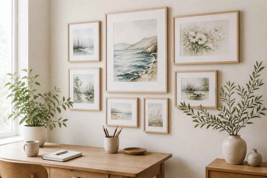
For gallery walls, start with a central anchor piece and build outward. Use uniform spacing (2-3 inches) between frames and consistent styles for coherence.
Watercolor Nursery Wall Decor Ideas and Color Coordination
Nurseries present a unique opportunity to use watercolor art intentionally. The space serves both aesthetic and developmental purposes, making thoughtful art selection particularly important.
Watercolor's soft aesthetic makes it ideal for children's rooms. Botanical prints introduce nature, while gentle abstracts create calm. The medium's luminous quality creates visual interest without overstimulation.
In nurseries, use soft greens, warm ochres, pale blues, and muted pinks to support relaxation. Avoid high-saturation colors or stark contrasts.
Match watercolor art to existing elements: warm tones with light wood, earth tones with pale walls. The goal is harmony, art that enhances rather than dominates.
Framing Tips for Watercolor Art and Preservation
How you frame and display watercolor art directly affects its longevity and visual impact. The right framing protects your investment while enhancing the artwork's appearance.
Framed vs. Canvas Print Options
Framed watercolor prints offer superior archival protection with UV-protective glass, mat boards, and finishes that reduce glare.
Canvas wraps offer a modern aesthetic but provide less archival protection than framed pieces and are more susceptible to dust and fading.
For watercolor, framing is superior. A giclee print on fine art paper with archival-quality materials preserves color saturation and texture for decades.
Archival Quality and Long-Term Care
Archival quality means acid-free paper, pigment-based inks, and UV-protective framing materials.
Giclee printing, a high-resolution inkjet process using pigment-based inks, is the gold standard for watercolor reproduction, resisting fading and maintaining color accuracy for decades.
Use acid-free mat boards, UV-protective glass, and air-circulation backing. Position away from direct sunlight and avoid kitchens or bathrooms where moisture and temperature fluctuate.
Color Palettes and Design Trends for 2026
Earth tones remain the leading palette, with clay reds, warm ochres, moss greens, and terracotta appearing across both botanical and abstract watercolor work. These colors evoke natural materials, clay, stone, earth, and create a grounding effect in modern interiors. They pair beautifully with light wood, natural textiles, and warm lighting.
Soft, muted palettes complement minimalist and transitional design styles. Pale blues, warm grays, soft pinks, and pale greens create visual interest without intensity. These colors work particularly well in bedrooms and studies, where a sense of calm focus is desired.
Matching Watercolor Art to Your Interior Style
Successful integration of watercolor wall art requires understanding how your chosen pieces relate to your room's overall design language.
Modern vs. Traditional Watercolor Aesthetics
Modern watercolor aesthetics emphasize abstraction, bold composition, and minimalist framing. These pieces often feature dramatic color contrasts, expressive brushwork, or geometric abstraction. They pair naturally with contemporary furniture, clean lines, and open floor plans. Modern watercolor art should feel intentional and unadorned, the focus stays on the artwork itself rather than elaborate framing.
Transitional Decor and Mixed Styles
Transitional design blends modern and traditional elements, creating spaces that feel both current and timeless. Watercolor art is particularly well-suited to transitional interiors because the medium itself bridges these aesthetics. A soft botanical watercolor in a simple frame works in both contexts.
Sustainability and Quality Considerations
As you invest in watercolor wall art, consider both the environmental impact of your choices and the long-term value of quality pieces.
| Watercolor Style | Best For | Key Characteristics | Color Range |
|---|---|---|---|
| Botanical Prints | Nurseries, Bedrooms, Living Rooms | Detailed plant studies, naturalistic | Earth tones, greens, warm ochres |
| Abstract Watercolors | Minimalist Spaces, Home Offices | Expressive brushwork, flowing forms | Soft palettes, muted hues |
| Landscape Paintings | Living Rooms, Entryways | Atmospheric scenes, soft focus | Blues, greens, warm earth tones |
| Mediterranean Art | Living Spaces, Studies | Coastal themes, sun-saturated light | Warm oranges, terracottas, blues |
Frequently Asked Questions
How do I choose the right size watercolor wall art for my wall?
Size depends on wall dimensions and room function. For living rooms, a large statement piece (30-40 inches) works well above sofas; for smaller spaces or bedrooms, 16-24 inches is ideal. The 2/3 rule suggests the art should occupy about two-thirds of the wall space above furniture. Measure your wall and furniture height before purchasing to ensure proportional balance. Consider the viewing distance, larger rooms allow for bigger pieces without overwhelming the space.
Does watercolor wall art work in modern home decor?
Absolutely. Abstract watercolor prints with soft palettes and minimalist compositions align perfectly with modern design. In 2026, abstract watercolors are favored for their fluid aesthetic and calming effect in contemporary interiors. Neutral abstracts and botanical watercolors add emotional depth and warmth to modern spaces without clashing with clean lines or minimalist furniture. Pairing watercolor art with simple frames or canvas wraps enhances its contemporary appeal.
How do I protect watercolor prints from fading over time?
Use archival-quality framing with UV-protective glass to shield pigment-based prints from light damage. Avoid direct sunlight; position watercolor art on walls away from windows or use light-filtering curtains. Giclee prints on acid-free paper with pigment-based inks offer superior longevity compared to standard prints. Frame with acid-free matting and backing to prevent deterioration. Store unframed prints in a cool, dry place. Proper framing and placement ensure your watercolor art maintains its visual texture and color saturation for years.
What are the best framing options for watercolor prints?
Framed options include traditional frames with matte finishes, which complement watercolor's delicate nature, or gallery-wrapped canvas, which offers a modern, seamless look. Matte finishes reduce glare and highlight the watercolor technique's subtle details. Choose archival-quality framing materials for preservation. Canvas wraps work well for bold abstract watercolors, while framed prints suit botanical illustrations and landscape paintings. Consider your interior styling and whether you prefer a focal point statement or subtle wall decor that blends with your room ambiance.