 ultimate-guide
How to Arrange a Gallery Wall: 2026 Layout Guide
Table of Contents
- Start With a Focal Point and a Measured Wall
- Gallery Wall Layout Templates That Cover Two-Thirds of the Wall
- The Best Spacing for Gallery Wall Frames (and How to Keep It Consistent)
- How to Hang a Gallery Wall Without Nails
- Test the Arrangement on the Floor Before You Commit
- Digital Visualization Tools and Lighting That Finish the Wall
- Frequently Asked Questions
Last Updated: September 10, 2026
Start With a Focal Point and a Measured Wall
A gallery wall is a curated arrangement of framed artwork hung as a single composition rather than scattered across a room. Learning how to arrange a gallery wall starts with two decisions that shape everything else: choosing an anchor piece and measuring the space you actually have. According to Rossetti Art's 2026 gallery wall guide, a single anchor piece is the primary strategy for a balanced, uncluttered composition. One larger print, whether a watercolor nursery scene or a historic aviation study, gives smaller pieces something to orbit.
Measure the Wall and Mark the 57-Inch Eye-Level Line
The standard hanging height is 57 inches to the center of the artwork, measured from the floor. The Inka Art House sizing and placement rules confirm this benchmark, often called the 145-centimeter rule, as the eye-level standard for 2026. Mark that line with painter's tape before you touch a hammer, then measure your wall's full width and height. Aim for the arrangement to cover about two-thirds of the available wall space, per Frameology's proportional recommendations.
Gallery Wall Layout Templates That Cover Two-Thirds of the Wall
Gallery wall layout templates remove the guesswork from composition. The two-thirds rule is the anchor: the arrangement should cover roughly two-thirds of the available wall width and height, leaving breathing room on all sides. A wall that is 8 feet wide, for example, wants an arrangement about 5 to 5.5 feet across, not edge to edge.
Do the Coverage Math Before You Choose a Layout
Measure the wall's usable width and height, then subtract for furniture and trim. A sofa, console, or headboard sets the lower boundary; crown molding and ceiling line set the upper. The arrangement should sit above the furniture with 6 to 10 inches of clearance, and stop at least 6 inches below the ceiling.
From there, work backward to frame count:
- Small wall (under 6 feet wide): 3 to 5 frames, one row or a tight 2x2 grid.
- Medium wall (6 to 9 feet wide): 5 to 7 frames, grid or asymmetrical.
- Large wall (over 9 feet wide): 7 to 9 frames, salon or a layered grid with a strong anchor.
Industry guidance for 2026 favors structured templates of 3, 5, or 7 frames, with total piece counts landing between 5 and 7 for a curated look (YMI Painting's 2026 frame arrangement guide). That restraint is deliberate: fewer, better-chosen pieces read as intentional, while a crowded wall reads as noise.
Grid, Salon, and Asymmetrical Arrangements
- Grid layout: matching frames in even rows and columns. Best for symmetrical spaces and uniform print sizes. Keep frame sizes identical or within 2 inches of each other, or the grid lines will visibly wobble.
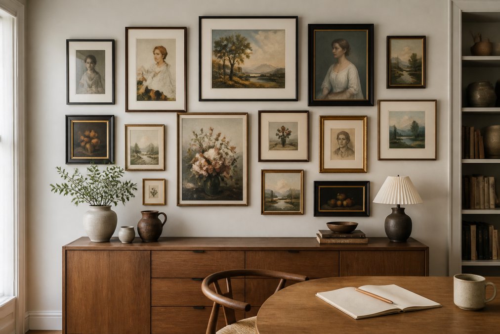
- Salon style: mixed sizes filling the wall edge to edge. Suits eclectic and boho interiors with collected pieces. The salon look depends on tight, uniform gaps, usually 2 inches, so the density reads as deliberate rather than accidental.
- Asymmetrical arrangement: balanced by visual weight rather than mirroring. A large anchor piece offset by smaller frames works well here. Balance a heavy piece on one side with two or three lighter pieces on the other.
| Layout | Best For | Piece Count | Difficulty |
|---|---|---|---|
| Grid | Modern, symmetrical walls | 4-9 | Easy |
| Salon | Eclectic, collected spaces | 7-15 | Advanced |
| Asymmetrical | Odd walls, stairwells | 5-7 | Moderate |
Match Hardware to Frame Weight
Layout and hardware are the same decision. A grid of lightweight prints can hang on adhesive strips or small picture hooks; a salon wall of mixed frames, some with glass, needs real anchors. As a rule of thumb, anything over about 10 pounds, which most glass-fronted frames exceed, should go into a stud or use a hollow-wall anchor rated for at least twice the frame's weight. D-rings and picture wire distribute load better than a single sawtooth hanger, and two hooks per frame keep a wide piece from tilting over time.
The Best Spacing for Gallery Wall Frames (and How to Keep It Consistent)
The best spacing for gallery wall frames is 2 to 3 inches between each frame. That gap is the single strongest signal of a cohesive arrangement, according to Frameology's family gallery wall guidelines, and it should stay identical across the entire wall. Consistency matters more than the exact number: a uniform 2.5-inch gap looks deliberate, while a wall that drifts between 1 and 4 inches looks accidental.
Matting changes the math. A wide mat adds visual breathing room inside the frame, so you can pull the outer gaps slightly tighter without the wall feeling cramped. Cut a spacer from scrap cardboard at your chosen gap width and use it for every measurement.
How to Hang a Gallery Wall Without Nails
Rental-friendly hanging methods let you build a full gallery wall without a single nail hole. Adhesive strips and hooks rated for framed art handle most lightweight prints, and removable putty works for very small pieces. The trade-off is weight: check the manufacturer's rating against your frame's total weight, glass included, and skip adhesives entirely for anything heavy or valuable.
For a middle path, use small picture-hanging hooks that leave pinhole-sized marks, easy to fill with a dab of spackle at move-out. Whichever method you choose, clean the wall first; dust and texture are the two most common reasons adhesive hooks fail overnight.
Test the Arrangement on the Floor Before You Commit
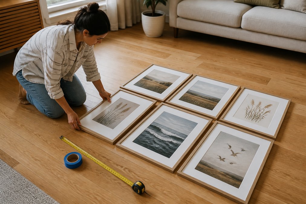
Laying the arrangement on the floor is the step most people skip, and it is the one that saves the most patching. It converts an abstract wall into a physical composition you can walk around, photograph, and edit before any hardware goes up. Treat it as a dry run with three passes: rough placement, spacing correction, and template transfer.
Pass 1: Rough Placement on the Floor
Clear a floor area at least as wide as your wall. Start with the anchor piece and place it slightly off-center rather than dead-center, a perfectly centered anchor tends to read as static, while a small offset gives the eye a reason to travel. Build outward from the anchor, keeping the heaviest visual weight (largest frame, darkest image, or busiest composition) low and toward the center of the cluster. Light, airy, or small pieces belong at the outer edges and top.
Stand back at least 8 to 10 feet and look down at the arrangement from the same angle a viewer would see it on the wall. Most practitioners find that a layout which looks balanced from directly above looks top-heavy once it is vertical, so tilt your head or crouch to approximate the wall view.
Pass 2: Correct Spacing and Alignment
Use a spacer cut from scrap cardboard at your chosen gap width, 2 to 3 inches is the standard, and slide it between every pair of frames on the floor. This catches the two most common layout errors before they reach the wall:
- Drift: gaps that start at 2 inches and creep to 4 inches across the arrangement.
- Misalignment: frame tops or centers that wander off a shared horizontal or vertical line.
For a grid layout, align both the tops and the centers of each row. For a salon or asymmetrical layout, align centers only, and let the outer edges fall where they may. If a piece feels wrong, move it now, floor edits cost nothing.
Pass 3: Transfer to the Wall With Kraft Paper Templates
Trace each frame onto kraft paper or leftover wrapping paper, cut out the templates, and label the back of each with the artwork it represents. Tape the templates to the wall with painter's tape, using your marked eye-level line as the horizontal reference for the center of the anchor piece.
Two practical details make the transfer accurate:
- Mark the hanging point on each template. Measure where the wire, sawtooth, or D-ring sits on the back of the actual frame, then transfer that measurement to the template and punch a small hole at that spot. When the template is taped up, the hole tells you exactly where the nail or hook goes, no re-measuring on the wall.
- Use a level on the template, not the frame. Paper templates are easier to nudge than hung frames, and a small bubble level laid across the template catches tilt before you commit.
Leave the templates up for a day if you can. Living with the layout through an evening and a morning reveals proportion problems that a five-minute glance misses. Once you are satisfied, hang the anchor piece first, then work outward, checking each new frame against the one beside it rather than against the wall.
Digital Visualization Tools and Lighting That Finish the Wall
Digital visualization tools let you preview a gallery wall at your exact wall dimensions before buying anything. Many framing and design apps let you upload a photo of your wall, drop in frames to scale, and test spacing and orientation in minutes. It is a faster version of the paper-template method, and it works especially well when you are ordering prints online and cannot hold them up first.
Lighting is the finishing layer most guides ignore. A picture light or adjustable spotlight aimed at the anchor piece pulls the eye exactly where you want it, and it flattens the shadows that make a gallery wall look flat after dark. Warm bulbs suit nostalgic and art-history-inspired prints; cooler light sharpens aviation and architectural pieces. For a nursery or child's room, watercolor nursery prints pair well with soft, diffused light that keeps colors gentle at bedtime.
Frequently Asked Questions
What is the rule for gallery walls?
Two rules anchor most layouts. Hang the center of the arrangement at eye level, which design guidance sets at 57 inches from the floor (the '145 centimeter rule'). Then keep the total composition covering about two-thirds of the available wall space. These two benchmarks give you a starting frame; adjust for ceiling height, furniture, and how the wall is viewed, whether seated or standing.
What are common gallery wall mistakes?
The most frequent problems are inconsistent gaps between frames, hanging too high above furniture, and overcrowding the wall. Design guidance for 2026 recommends 5 to 7 pieces and a 2 to 3 inch gap between frames to keep the arrangement cohesive. Skipping the paper-template step also causes extra nail holes and crooked rows, since most people eyeball spacing instead of measuring it.
Are gallery walls out of style in 2026?
No, but the style has shifted. Current design guidance favors curated, less cluttered arrangements, typically 5 to 7 pieces, over dense floor-to-ceiling displays. Many designers now suggest starting with one anchor piece and building outward over time rather than planning the entire wall in advance. A restrained, intentional layout reads as current; a packed wall of mismatched frames reads as dated.
How do you arrange a gallery wall without damaging walls?
Use adhesive strips rated for the weight of each frame, or small picture-hanging hooks that leave only pin-sized holes. Clean the wall with rubbing alcohol first, press each strip firmly for 30 seconds, and let it set for an hour before hanging. Keep total weight per strip within the manufacturer's limit, and avoid adhesive on textured, freshly painted, or wallpapered surfaces where it may pull finish away.
Arranging a gallery wall comes down to measurement, restraint, and one piece worth building around. RunwayandHeirloomArt offers instant-download prints across aviation, nursery, and art-history themes, so you can start with a single statement piece and build outward at your own pace. The watercolor art style and diverse subject range make it easy to find a focal point that actually means something to you. Get started with RunwayandHeirloomArt and turn a bare wall into a collection with a story.