 ultimate-guide
How to Choose Wall Art for Every Room: 2026 Guide
Table of Contents
- The 5 Questions to Answer Before Buying Any Wall Art
- How to Choose Art Size for Wall: Scale and Proportion Rules
- Wall Art Placement Rules: Height, Lighting, and Flow
- Choosing Art for Nursery: Designing a Room That Grows
- How to Arrange a Gallery Wall Without the Guesswork
- Matching Art to Room Mood: Color, Texture, and Personality
- The Art of Preservation: Framing and Care Tips
- Final Thoughts: Building a Collection You Love
- Frequently Asked Questions
Last Updated: September 9, 2026
Choosing wall art can feel overwhelming, but the process is simpler when you start with intention rather than trends. Learning how to choose wall art for every room begins with understanding that art is not just decoration; it is a reflection of personality, memory, and mood. At Runway & Heirloom Art, we believe a well-chosen piece should tell a story, whether it evokes nostalgia, fuels a passion for aviation, or introduces a child to a world of imagination. Recent data shows that 46% of consumers have at least one piece of wall art in every room, and 86% of them report being happier with their home's atmosphere (InPrint Designs Wall Art Statistics).
The secret to successful art selection isn't about matching trends; it is about answering a few honest questions about your space and yourself. Below, we'll show you exactly how to evaluate scale, placement, and mood so you can build a collection that feels both distinctive and enduring.
The 5 Questions to Answer Before Buying Any Wall Art
Before you browse a single print, ask yourself five questions: what is the room's primary function, what mood do you want to evoke, what is the available wall space and furniture beneath it, what colors and textures already exist, and what story do you want the piece to tell?
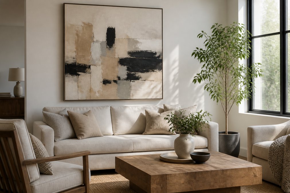
Answering these questions prevents the most common mistake: buying a piece you love in the store but that feels disconnected at home. Professional designers argue that art should be chosen based on scale, mood, and room function rather than following temporary aesthetic trends (Nook at You Designer Insights). Your taste is the starting point; the room's context is the filter.
How to Choose Art Size for Wall: Scale and Proportion Rules
Getting the size right is the single most important technical step. The most common error is hanging a piece that is too small for the wall, leaving it looking lost and insignificant. A widely cited rule for 2026 interior design is that wall art should occupy 60-75% of the available wall space above furniture to ensure proper scale and visual balance (My Photo Station 2026 Trend Guide).
The 60-75% Rule for Furniture and Walls
Measure the width of your sofa, bed, or console table. Your art should cover roughly two-thirds of that width. For example, if you have a 72-inch sofa, your main piece or grouping should be between 43 and 54 inches wide.
Wall Art Placement Rules: Height, Lighting, and Flow
The standard museum rule is to hang the center of a piece at 57 to 60 inches from the floor, aligning with average adult eye level. But this rule shifts based on the room's primary activity: in a dining room where people are seated, the center should drop to roughly 54 to 57 inches; in a hallway, 60 to 66 inches feels more natural; in a child's room, hang art at the child's eye level so they can engage with it directly.
Above furniture, the bottom edge of the frame should sit 6 to 12 inches above the back of a sofa, headboard, or console. If the gap is larger, the art visually floats away; if smaller, it feels cramped. For an 84-inch sofa, a single piece or grouping should span roughly 50 to 63 inches.
Lighting is where most rooms fail. A picture light mounted on the frame casts a focused pool of light but can create glare on glass. Recessed ceiling spotlights with a 30-degree beam angle aimed at the art's center avoid glare and highlight texture. Track lighting offers flexibility: position heads 12 to 18 inches from the wall and angle them at 30 degrees. For prints under glass, use non-glare or museum-grade glass.
Flow is about sightlines and movement. Art should not compete with architectural features like windows, doors, or staircases. In a narrow hallway, keep the piece's width to 60% of the wall's width. In a corner, avoid hanging art at a 45-degree angle unless it is intentionally part of a vignette, angled art often looks like a mistake.
One overlooked factor is the relationship between art and furniture height. If your sofa has a low back (30 inches or less), hang art slightly lower than the 6-to-12-inch rule suggests. If the sofa has a tall back (36 inches or more), increase the gap to 12 to 18 inches so the art does not disappear behind the furniture line.
For multi-piece arrangements, treat the entire grouping as one unit. The center of the full arrangement should sit at eye level, and spacing between frames should be consistent, typically 2 to 3 inches. Use a laser level for horizontal alignment, but do not obsess over perfect symmetry; a balanced but slightly organic arrangement often feels more curated than a rigid grid.
Choosing Art for Nursery: Designing a Room That Grows
Nursery art is about more than matching a color palette; it is about creating an environment that stimulates imagination and provides comfort. Focus on themes that can grow with the child. A whimsical watercolor of a vintage airplane or a gentle art-history-inspired print can transition from a crib room to a toddler's play space to a school-age child's study without feeling childish.
At Runway & Heirloom Art, our watercolor nursery prints are designed to be enduring. We focus on subjects like classic aircraft, trains, and charming animal scenes that introduce a child to a world of curiosity. Rather than opting for overly themed decor that must be replaced, choose pieces with a sophisticated palette that complements your nursery's color scheme while offering a story that unfolds as the child grows.
How to Arrange a Gallery Wall Without the Guesswork
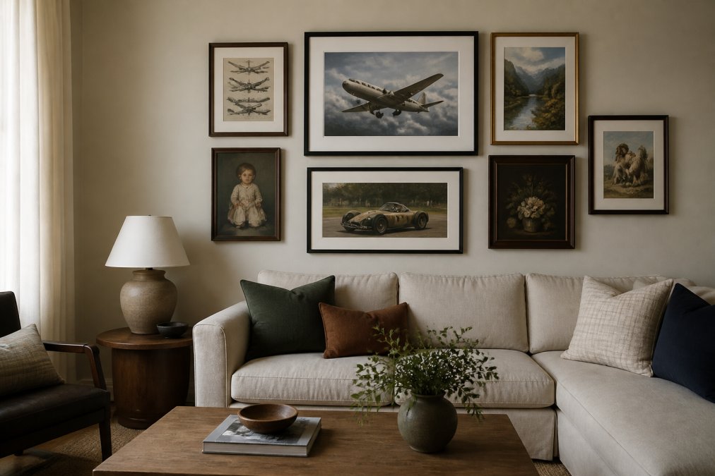
A gallery wall can feel daunting, but it is simply a matter of planning on the floor before you commit to the wall. Lay out your frames on the floor or a large table, arranging them in a dynamic composition that balances larger pieces with smaller ones. The goal is a cohesive unit with consistent spacing, typically 2 to 3 inches between frames.
Consider the visual weight of each piece. Mixing mediums, such as a watercolor print next to a classic oil painting print, adds texture and depth. To achieve cohesion, look for a common thread, a color palette, a similar frame style, or a thematic connection like a curated collection of aviation prints. This turns a group of individual pieces into a single, intentional statement.
Matching Art to Room Mood: Color, Texture, and Personality
Art is a powerful tool for setting a room's emotional tone. Industry guidance suggests choosing art based on the room's intended purpose: warm tones for welcoming spaces, calming hues for relaxation, and vibrant colors for high-energy areas. For a study or office, art that sparks focus and inspiration, such as detailed aviation or classic car prints, can energize your work ethic. For a bedroom, softer palettes and serene subjects promote rest.
The texture of the art itself also plays a role. A canvas print offers a different tactile feel than a paper print under glass. Consider how the art interacts with your existing decor, does it add a layer of texture that makes the room feel richer? A room decorated with personality and texture feels curated and lived-in, not staged.
The Art of Preservation: Framing and Care Tips
Most wall art guides stop at selection and hanging, but preserving your investment is what separates a collection that lasts decades from one that fades in two years. The threats are specific to each room in your home.
In the kitchen: Grease and steam are the silent killers. Cooking oils aerosolize and settle on surfaces, creating a sticky film that attracts dust and can yellow paper over time. Keep art at least 6 feet from the stove and avoid hanging pieces directly above a boiling pot. If you must hang art in a cooking zone, choose canvas prints without glass, glass traps moisture and grease can seep into the frame edges. Wipe the frame monthly with a barely damp microfiber cloth, never a spray cleaner.
In the bathroom: Humidity is the primary enemy. Paper prints and watercolors absorb moisture, causing buckling and mold growth. Use a print on aluminum or acrylic, which are impervious to humidity, or a canvas print sealed with a UV-protective varnish. If you insist on paper, frame it with a sealed backing and a desiccant packet inside the frame, and avoid hanging it directly in the shower's steam path.
In sunlit rooms: Ultraviolet light is the most destructive force for any artwork. UV rays break down pigments and paper fibers, causing irreversible fading. The solution is not just UV-protective glass, it is also placement. South-facing windows in the United States receive the most intense direct sunlight. If a piece must hang on a south-facing wall, use museum-grade UV glass, which blocks 97% of UV rays, and consider a sheer curtain to diffuse the light during peak hours (roughly 10 a.m. to 4 p.m.).
Matting is structural, not just decorative. A mat creates an air gap between the art and the glass, preventing condensation from sticking the print to the glass. Without a mat, temperature changes can cause the print to adhere to the glass, permanently damaging the surface. Always use acid-free or archival mats, standard cardboard mats contain lignin, which leaches acid into the paper over time.
Dusting and cleaning: Use a soft, dry brush or a microfiber cloth to dust frames weekly. Never spray glass cleaner directly on the glass, liquid can seep into the frame's edges and damage the print. Instead, spray the cleaner onto a cloth and wipe the glass. For canvas prints, use a soft brush attachment on a vacuum at low suction.
Digital downloads and DIY framing: For prints you print yourself, the paper quality matters as much as the image. Use a matte or luster paper with a minimum weight of 200 gsm (grams per square meter), thinner paper is more prone to curling and moisture damage. If you are framing a digital download at home, use a frame with a backing board and a sealed dust cover on the reverse side to prevent dust and insects from entering the frame cavity. For high-value pieces or limited editions, professional framing with archival materials is worth the cost.
Room-by-room preservation checklist:
- Kitchen: 6 feet from stove, no glass over cooking zones, monthly frame wipe
- Bathroom: aluminum or acrylic prints, sealed backing, no paper near shower
- Sunlit rooms: UV glass, sheer curtains, avoid south-facing walls for watercolors
- Hallways: dust monthly, check for loose hanging hardware every six months
- Children's rooms: use shatterproof acrylic instead of glass, secure with wall anchors
By matching your framing and placement choices to the room's environmental realities, you protect your art from the specific threats each space presents. This is the difference between art that looks new in a decade and art that looks faded in two years.
Final Thoughts: Building a Collection You Love
The best wall art is not a passing trend but a reflection of your history, passions, and the atmosphere you want to create. Whether you are drawn to the nostalgia of a vintage aircraft, the charm of a watercolor nursery print, or the elegance of an art-deco piece, the key is to buy what speaks to you.
At Runway & Heirloom Art, we specialize in digital download prints inspired by art history, aviation, and childhood. Our collection offers instant access to affordable, high-quality art that you can print at your preferred size and frame to match your space perfectly. From a curated selection of historic aviation prints to charming watercolor nursery art, our goal is to help you discover pieces that become part of your home's story.
Frequently Asked Questions
What is the 3-5-7 rule in decorating?
The 3-5-7 rule is a guideline for creating visually balanced arrangements. It suggests grouping decor items in odd numbers, as they are more dynamic and natural to the eye than even numbers. For wall art, this often translates to hanging pieces in groups of three, five, or seven. Odd numbers create a focal point and a sense of rhythm, preventing a space from feeling too symmetrical or static. Start with a trio of complementary prints to build a cohesive vignette.
What is the 2/3 rule for wall art?
The 2/3 rule is a simple ratio for determining the ideal width of a piece of art relative to the furniture beneath it. As a general guide, your art should be about two-thirds the width of your sofa, bed, or console table. For example, a 60-inch sofa pairs well with a 40-inch wide piece. This proportion ensures the art anchors the furniture and creates visual balance. For oversized statement pieces, the 60-75% rule is a modern alternative.
How do you choose wall art for a nursery that grows with the child?
To choose nursery art that lasts, focus on themes and colors that are not strictly babyish. Watercolor pieces with soft palettes and subjects like animals, hot air balloons, or classic storybook characters transition well from a crib to a toddler bed and beyond. Choose prints with a timeless quality, and use framing to elevate them. A gallery wall with a mix of whimsical and art-history-inspired pieces can evolve easily by swapping out just one or two frames as your child grows.
How high should wall art be hung for optimal viewing?
The center of your artwork should hang at eye level, which is typically 57 to 60 inches from the floor. This standard is used by museums and galleries because it suits the average viewer. When hanging art above a sofa or headboard, keep the bottom edge 6 to 12 inches above the top of the furniture. For gallery walls, treat the entire arrangement as one single piece and center the whole cluster at that 57-inch mark.
Choosing the right wall art for every room is a journey of balancing personal taste with practical design principles. It requires looking beyond fleeting trends to find pieces that resonate with your lifestyle and the function of each space. Runway & Heirloom Art helps you curate that collection with diverse, story-driven prints that bring history, imagination, and personality into your home. Get started with Runway & Heirloom Art and discover art that feels both distinctive and enduring.