 listicle
What Are the Baby Color Trends for 2026?
Last Updated: October 29, 2026
Quick Summary
The baby color trends for 2026 lean warm, muted, and nature-inspired, with mushroom, cocoa brown, sage, dusty olive, and soft ocean blues replacing bright pastels. Parents are choosing calm, adult-feeling rooms built on neutral bases with earthy, layered tones.
- Warm neutrals like mushroom, cocoa brown, terracotta, and warm beige dominate 2026 nursery palettes.
- Use the 60-30-10 rule: 60% dominant, 30% secondary, and 10% accent color.
- Sage green works as a full-wall color, while heavier dusty olive suits a single accent wall.
- Reserve deep teal for the 10% accent because a full wall shrinks a room fast.
- Test paint samples at morning, mid-afternoon, and after dark under the nursery lamp.
Table of Contents
- The 2026 Baby Color Trends, at a Glance
- Nursery Color Palette Ideas You Can Actually Build Around
- Gender-Neutral Nursery Colors That Don't Feel Beige
- Blue, Ocean-Inspired, and Blush Palettes for 2026
- How Light and Room Orientation Change the Color You Chose
- Nursery Wall Art Ideas That Match the 2026 Palettes
- Nursery Colors That Grow With Your Child
- Building Your 2026 Palette With Art That Lasts
- Frequently Asked Questions
The 2026 Baby Color Trends, at a Glance
The baby color trends for 2026 lean warm, muted, and quietly nature-inspired. Mushroom, cocoa brown, sage, dusty olive, and soft ocean blues are replacing the bright pastels that once defined nurseries. For broader nursery design and decor ideas to apply these color trends to a full room, see Ideas for a Nursery: Design & Decor for Every Style.
The shift is easy to explain. Parents want rooms that feel calm and adult, not themed. Nursery Design Studio's 2026 color trend roundup lists warm mushroom, cocoa brown, and other muted earthy shades among the year's biggest nursery colors, while Pehr's nursery styling notes recommend a neutral base with ocean-inspired textiles layered on top.
Below, we break down each direction, the proportions that make a muted palette work, and the practical details most trend articles skip: lighting, safety, and how to pick art you won't repaint around in two years.
Warm Neutrals and Earth Tones Take the Lead
Warm neutrals are the year's dominant story. Think mushroom, cocoa brown, terracotta, and warm beige, often layered tone-on-tone rather than contrasted. A warm white ceiling and sandy neutral walls give you a base that flatters almost any art you hang on it.
The appeal is practical. Earth tones hide scuffs better than bright white, they photograph well, and they let you swap accessories without repainting. We'd pair a cocoa accent wall with mushroom bedding and one muted terracotta textile for depth. Skip the matching furniture set; mismatched wood tones read warmer.
Sage, Olive, and the Return of Nature-Inspired Greens
Nature-inspired greens remain the most requested direction. Nursery Design Studio's trend report names sage green and dusty olive among the leading colors, and Nestig's design notes describe soft terracottas, sage greens, and warm ochres as the tones designers are backing.
Soft sage works as a full-wall color in a small room because it stays quiet in low light. Dusty olive is heavier, so we'd use it on a single accent wall or in textiles. Pair either with warm white trim and a blush taupe rug to keep the room from feeling cold.
Here are the muted, nature-inspired directions defining nursery color in 2026.
| Trend direction | Key colors | How to use it |
|---|---|---|
| Warm neutrals and earth tones | Mushroom, cocoa brown, terracotta, warm beige | Layer tone-on-tone; cocoa accent wall with mushroom bedding |
| Nature-inspired greens | Sage green, dusty olive | Sage as full-wall color; dusty olive on one accent wall |
| Ocean-inspired blues | Pale sky, mist blue, dusty blue, slate blue, deep teal | Pale blue full-wall; deep teal only as 10% accent |
| Blush and soft pink | Blush taupe, muted terracotta, coral | Blush taupe on 30% layer; coral riskiest, test under lamp |
| Lavender and mauve | Grayed lavender, mauve | Use as 30% layer against warm neutral base |
Nursery Color Palette Ideas You Can Actually Build Around
Most palettes fail on proportion, not color choice. A room with five muted shades at equal weight reads as muddy. The fix is a simple ratio that designers use constantly.
The 60-30-10 Rule for Muted Palettes
The 60-30-10 rule is a proportion guideline where 60% of a room is a dominant color, 30% is a secondary color, and 10% is an accent. In a muted nursery, that means:
- 60% (walls, large furniture): warm white, mushroom, or sandy neutral
- 30% (crib bedding, rug, curtains): sage, dusty blue, or blush taupe
- 10% (art, pillows, small décor): muted terracotta, olive, or coral
Three ready-to-use combinations:
- Warm neutral base: mushroom walls, warm white crib, sage bedding, terracotta accents in framed art
- Coastal calm: soft blue walls, sandy neutral rug, warm white furniture, dusty blue and coral art
- Heritage green: dusty olive accent wall, warm white elsewhere, blush taupe textiles, muted gold frames
Gender-Neutral Nursery Colors That Don't Feel Beige
Gender-neutral does not have to mean beige. The 2026 answer is color with the saturation turned down: sage, dusty blue, mushroom, ochre, and muted terracotta all read neutral without going flat.
The trick is texture. A room in three shades of warm neutral feels intentional when you mix a woven basket, a linen curtain, and a matte painted wall. Add one deeper tone, like olive or cocoa, to anchor the space. Animal prints, stripes, and bears work well here because they add pattern without adding a gendered color story.
Three gender-neutral combinations that hold up beyond the nursery years:
- Sage and cocoa: sage walls (60%), warm white crib and dresser (30%), cocoa and ochre accents in art and a knit blanket (10%). Reads calm in daylight and warm under a lamp.
- Dusty blue and mushroom: mushroom walls (60%), dusty blue bedding and curtains (30%), muted terracotta art and a woven basket (10%). The blue keeps the mushroom from going muddy.
- Ochre and warm white: warm white walls (60%), ochre and sage textiles (30%), olive and cocoa accents (10%). The brightest of the three; best in a south-facing room where the light can carry the ochre.
Gender-neutral extends past paint into the products you'll actually use.
One caution on pattern: animal prints and stripes are the easiest way to add interest without a gendered color, but keep them to one or two patterns per room. A bear print, a stripe, and a check in the same palette compete rather than layer.
Blue, Ocean-Inspired, and Blush Palettes for 2026
Soft blue-green is the year's quietest direction. HALO's color trend coverage describes Behr's 2026 Color of the Year, Hidden Gem, as a soft blue-green, and ocean-inspired textiles appear throughout Pehr's styling recommendations. Pair dusty blue with warm white and a sandy neutral rug for a coastal calm room that still feels warm.
The blue family is broader than one shade. Three workable tiers:
- Pale sky and mist blue: the safest full-wall choice in small rooms; reads almost neutral in north-facing light.
- Dusty blue and slate blue: better as the 30% layer in bedding, curtains, and a rug, where the gray undertone keeps it from looking nautical-themed.
- Deep teal and ocean green: reserve for the 10% accent, a framed print, a woven basket, a single pillow, because a full wall of deep teal shrinks a room fast.
Blush, coral, and soft pink round out the year for anyone who wants warmth without pastel sweetness. Muted terracotta and blush taupe keep pink from reading babyish. A practical split: blush taupe on the 30% layer (bedding, rug), muted terracotta on the 10% accent (art, a knit throw), and warm white or mushroom on the 60% base.
Lavender and mauve work the same way: use them as the 30% layer against a warm neutral base rather than as a full-wall color.
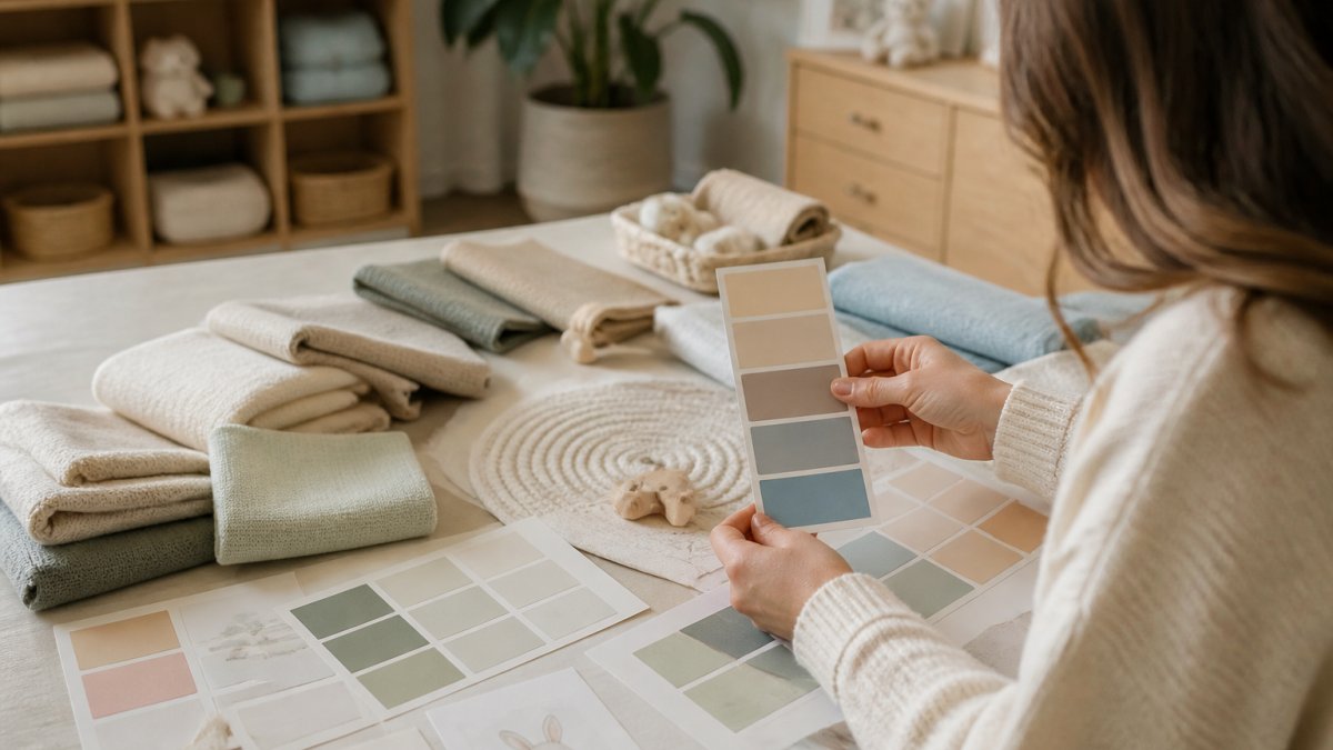
Matching a textile to the wall color is easier than matching paint to paint, because fabric samples can leave the store with you. Bring a crib sheet or swaddle to the paint aisle rather than the other way around.
How Light and Room Orientation Change the Color You Chose
A paint chip is not the color you'll live with. North-facing rooms pull blue and gray out of any shade, so a sage that looks soft in the store can turn cold on the wall. South-facing rooms warm colors up, and a mushroom can read almost peach by late afternoon.
Test before you commit. Paint a large sample board and move it around the room at three times of day: morning, mid-afternoon, and after dark under the nursery lamp. Warm white bulbs will shift everything yellow; cooler bulbs will pull greens toward gray. This is the step most guides skip, and it's the one that prevents repainting.
Nursery Wall Art Ideas That Match the 2026 Palettes
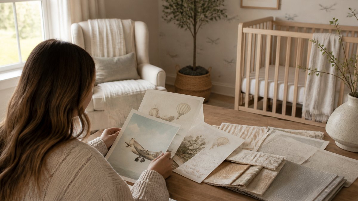
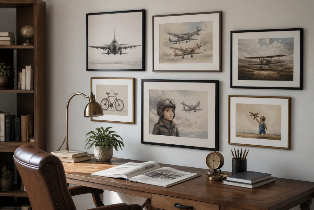
Art is where a muted palette gains personality. A watercolor animal print in sage and ochre gives a mushroom wall a focal point without breaking the calm. Our Watercolor Nursery Art collection offers soft, nature-inspired watercolor prints.
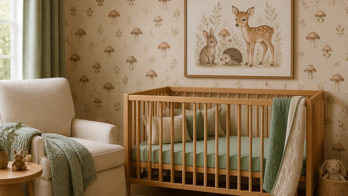
A practical note: hang nothing directly above the crib, and use a shelf or the wall beside it instead. For safe hanging guidance, follow our step-by-step guide to hanging nursery art safely.
Nursery Colors That Grow With Your Child
The strongest argument for 2026's muted palettes is longevity. Sage, mushroom, and dusty blue do not date the way a themed room does, so the paint stays while the furniture and art change. Choose pieces that shift with the child: a convertible crib, reusable storage baskets, and art that reads as charming at two and sophisticated at ten. Explore nursery wall art collections that grow up with your child.
Building Your 2026 Palette With Art That Lasts
Here is how we'd sequence the work:
- Pick your 60% base and paint a large sample board
- Test it in the room at three times of day
- Choose the 30% layer in textiles, not paint
- Add 10% accents through framed art
- Hang everything with proper anchors, away from the crib
Frequently Asked Questions
What are the most popular nursery colors for 2026?
Warm neutrals and nature-inspired shades lead the 2026 baby color trends. Warm mushroom, cocoa brown, terracotta, and warm beige are among the popular directions, alongside sage green and dusty olive. Soft blue-green tones are also having a moment. The common thread is muted, layered color rather than bright pastels or high-contrast themes.
Are neutral nurseries still in style in 2026?
Yes, but the neutrals have shifted warmer. Instead of cool grays and stark white, the 2026 palette favors mushroom, cocoa brown, sandy neutrals, and warm white. A neutral base for nursery palettes makes sense: a warm neutral wall lets you layer in sage, dusty blue, or muted terracotta through textiles and art without repainting later. That flexibility is why neutrals keep showing up in gender-neutral nursery colors and rooms designed to grow with a child.
How do I choose nursery wall art to match a color palette?
Pick art after you have locked in your base wall color, then pull one or two accent shades from the print into the room through bedding, a rug, or a throw. For warm neutral rooms, watercolor prints in sage, ochre, or muted terracotta sit naturally. For blue-green palettes, look for pieces with soft coastal or botanical tones. Framing matters too: a simple wood or thin black frame keeps the art tied to the room instead of competing with it.
What nursery colors work well for a room that grows with a child?
Warm neutrals, sage, dusty blue, and muted terracotta all age well because they are not tied to a single stage. A room painted in warm white or mushroom can shift from nursery to toddler room to study with new bedding, art, and furniture rather than a repaint. Choose a low-VOC paint in a muted tone, invest in convertible furniture, and treat bold color as an accent you can swap. That approach keeps the room feeling current through every phase.
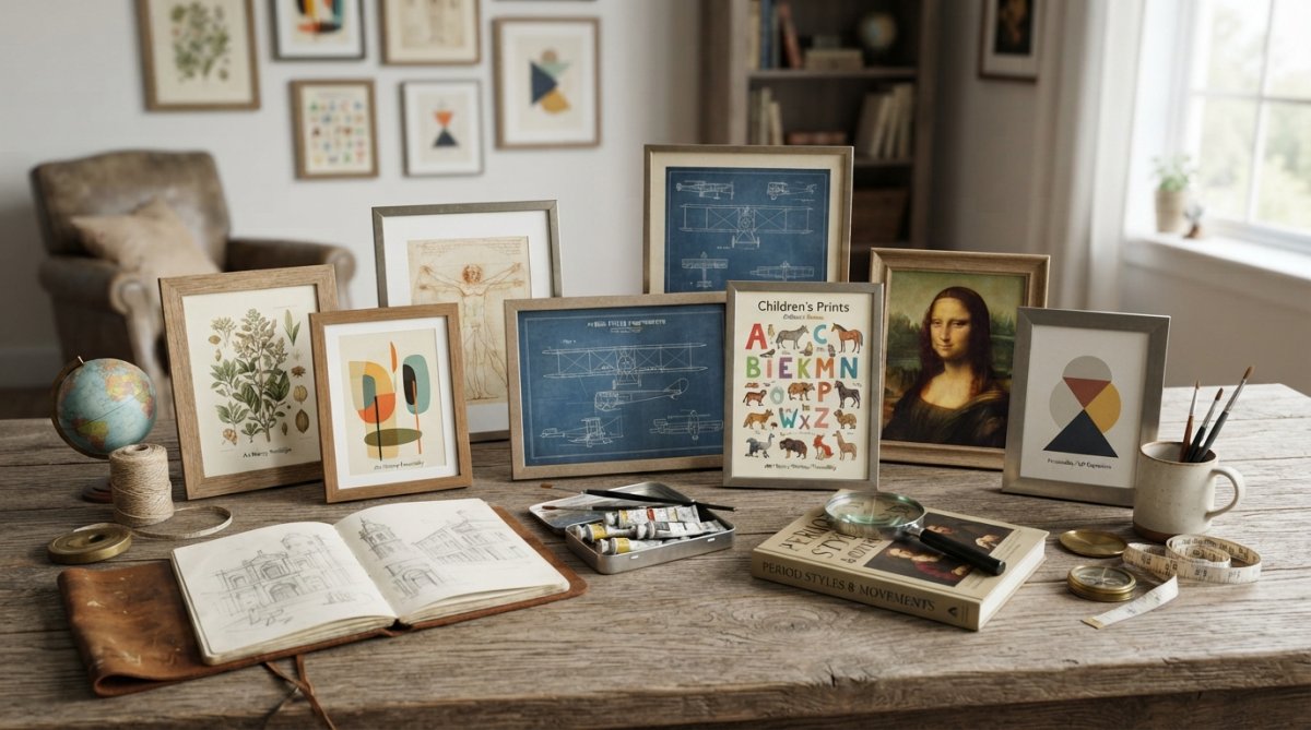
The hardest part of a muted nursery is finding art that matches the palette instead of fighting it. At RunwayandHeirloomArt, we curate prints inspired by art history, childhood, and nostalgia, including watercolor nursery pieces and decorative prints made to sit quietly against warm neutrals and sage walls. Browse the collection and build a room that still feels right years from now.