 how-to
How to Choose Art History Prints for Bedrooms
Table of Contents
- Start With the Room, Not the Print
- The Best Art Styles for Bedrooms: Matching Movements to Moods
- How to Choose Art History Prints That Fit Your Bedroom's Light
- Print Quality, Framing, and UV Protection: What Actually Lasts
- How to Hang Art History Prints Without Damaging Walls or Art
- Curating a Gallery Wall in the Bedroom Without Visual Clutter
- Preservation and Humidity: Keeping Prints Heirloom-Quality
- Conclusion
- Frequently Asked Questions
Last Updated: September 27, 2026
Start With the Room, Not the Print
Most people pick art first and figure out placement later. That is backwards. Art history prints work best when the room tells you what it needs.
Measure Your Wall Space and Identify Your Focal Point
Start with a tape measure, not a shopping cart. The wall above your bed is almost always the focal point and sets the scale for everything else.
Here is the rule that saves the most returns:
- Art should span 60-75% of the width of your bed or headboard
- Leave at least 15-20 centimeters (6-8 inches) of breathing room below the frame
- Center the piece on the bed, not the wall, if the two do not line up
Map Your Existing Color Palette
Pull three colors from what is already in the room, bedding, rug, one accent piece, and your print should echo at least two.
The Best Art Styles for Bedrooms: Matching Movements to Moods
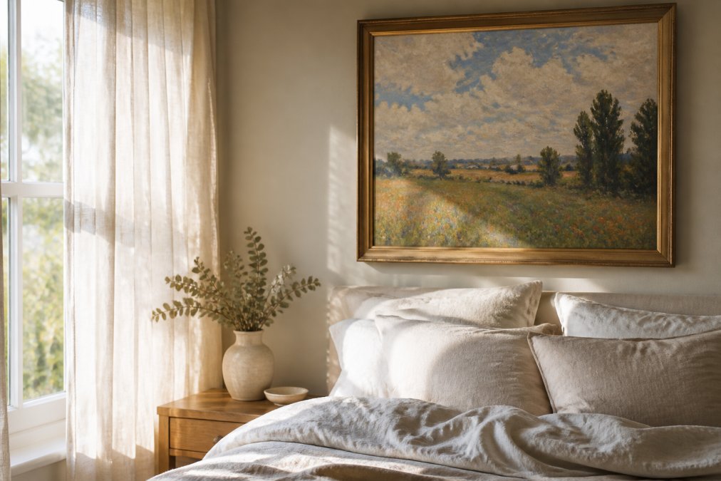
The best art styles for bedrooms depend on the mood you want. Soft, airy rooms suit Impressionist and botanical work; bold, symmetrical rooms suit Art Deco and Mid-Century prints. Each movement carries an emotional signature, and matching it to your room does half the design work.
Impressionism and Post-Impressionism for Soft, Airy Rooms
Impressionist prints bring diffused light, loose brushwork, and gentle color, calming a space instead of commanding it.
Choose these when your bedroom has:
- Pale walls, white bedding, or lots of natural light
- Soft textures like linen, cotton, or wool
- A restful, uncluttered feel you want to protect
Art Deco and Mid-Century Prints for Bold, Symmetrical Spaces
Art Deco prints bring geometry, contrast, and a sense of occasion, anchoring a room with strong lines.
Reach for these when your bedroom features:
- Symmetrical furniture placement or matching nightstands
- Deep tones like navy, emerald, or charcoal
- Metallic accents in brass or chrome
How to Choose Art History Prints That Fit Your Bedroom's Light
Light decides how a print looks on your wall, not on your screen. A print that glows in a bright room can turn muddy in a dim one, pigment, paper, and glazing all interact with the light's color temperature and intensity.
- Bright, cool light: warm-toned prints hold their own
- Dim, warm light: lighter prints with high contrast stay readable
- Mixed or shifting light: mid-tone prints with clear subjects work best
Why Art History Movements Read Differently Under Different Light
Each movement was painted for a specific kind of light, and that light is baked into the palette.
Reading Natural Light Throughout the Day
North-facing rooms stay cool and even; south-facing rooms swing from harsh to warm; east and west rooms change dramatically, making high-contrast prints risky. The fix: tape a sheet of paper in the print's dominant color to the wall and watch it for a day. It shows where light hits hardest and where it falls off, a five-minute test that prevents a five-year regret.
Color Temperature, Sleep, and the Bedroom-Specific Angle
Bedrooms are the one room where light has a second job: it affects how easily you fall asleep. Melatonin production is sensitive to the blue end of the spectrum, which is why sleep researchers and the CDC's sleep hygiene guidance recommend warmer, dimmer light before bed. A print with a large field of cool blue or bright white reflects more blue-heavy light in a room lit by screens or cool LEDs, reinforcing the alerting signal; a print dominated by warm earth tones, ochre, terracotta, deep umber, reflects warmer light and supports the wind-down window.
A Quick Light-Matching Cheat Sheet by Movement
| Movement | Best Light | Avoid |
|---|---|---|
| Impressionism | Cool daylight, bright north light | Single warm lamp only |
| Post-Impressionism | Mixed daylight | Harsh direct sun |
| Baroque / Dutch Golden Age | Warm, dim, lamp-lit | Cool fluorescent |
| Art Deco | Even neutral light | Very warm or very cool extremes |
| Minimalism / Bauhaus | Balanced neutral daylight | Warm-lamp-only rooms |
| Botanical / Natural History | Bright, diffuse daylight | Dark corners |
Use the table as a starting filter, then trust your eye in the room. The print that looks right at 7 a.m. and again at 10 p.m. belongs on the wall.
Print Quality, Framing, and UV Protection: What Actually Lasts
Print quality, framing, and UV protection determine whether your art lasts five years or fifty. Start with the paper: Archival paper is acid-free and resists yellowing for decades, while standard poster stock shifts color even in indirect light.
Then check the ink and resolution:
- Giclée or pigment-based inks outlast dye-based inks by a wide margin
- High-resolution files (300 DPI at final print size) keep detail crisp
| Feature | What to Look For | Why It Matters |
|---|---|---|
| Paper | Archival, acid-free | Prevents yellowing |
| Ink | Pigment-based | Resists fading |
| Glazing | UV-filtering | Blocks light damage |
| Matting | Acid-free board | Prevents moisture contact |
| Documentation | Certificate of authenticity | Confirms edition and origin |
How to Hang Art History Prints Without Damaging Walls or Art
Hanging art history prints safely comes down to three things: height, hardware, and anchor points.
Follow these steps:
- Mark your centerline with a pencil and level
- Hold the frame against the wall and mark the top corners lightly
- Measure the distance from the frame's top edge to its hanging wire
- Mark your hook points at that distance below your top marks
- Use wall anchors rated for at least twice the frame's weight
- Check level one final time before you let go
Curating a Gallery Wall in the Bedroom Without Visual Clutter
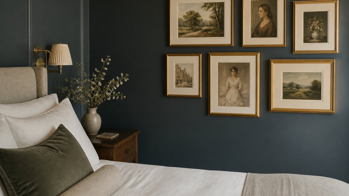
Curating a gallery wall in the bedroom works when you limit the palette and vary the scale. The difference between a wall that looks intentional and one that looks like a dorm room is whether the prints have a reason to be together, usually art history. A wall built around a single movement, period, or visual thread reads as a collection; one built around "prints I liked at different times" reads as clutter, no matter how well the frames are spaced.
Build the Wall Around a Movement, Not a Color Scheme
Most gallery wall advice starts with color. Start with a movement instead, and the color takes care of itself.
A few combinations that work in bedrooms:
- Impressionist landscapes: three to five pieces from the same period, unified by soft light and loose brushwork. Works above a bed or on a long side wall.
- Botanical and natural history plates: vintage-style botanical illustrations from the 18th and 19th centuries. The muted greens and creams read as calm, and the consistent format creates rhythm without effort.
- Japanese ukiyo-e woodblock prints: Hokusai and Hiroshige landscapes share a flat perspective and limited palette that make them easy to group. The Great Wave is the obvious anchor; pair it with two or three quieter landscape prints.
- Bauhaus and mid-century geometrics: strong grids and primary colors. Best in a room that already has clean lines and neutral walls, because the prints will do all the talking.
- Baroque portrait etchings: Rembrandt, Dürer, and their contemporaries in black-and-white. A row of small dark frames on a light wall is one of the most underused bedroom looks.
The Bedroom-Specific Rules That Keep It Calm
Bedrooms are not living rooms: a gallery wall that energizes a hallway will keep you awake. A few constraints help:
- Stick to one movement or one era across all prints
- Mix sizes, but keep one dominant piece as the anchor
- Keep spacing consistent, usually 5-8 centimeters (2-3 inches) apart
- Limit the wall to 5-9 pieces so it reads as a set
- Favor a single frame finish, all black, all natural wood, or all brass, rather than mixing
- Keep the total palette to three colors or fewer
Sourcing Art History Prints Without Overpaying
Most guides tell you to "invest" in art, fine for collectors, useless for someone furnishing a bedroom. A more practical approach: treat the gallery wall as one or two pieces you care about plus several that hold the composition together. Public-domain archives like the Metropolitan Museum of Art's Open Access collection, the Rijksmuseum, and the National Gallery of Art offer high-resolution downloads of works by Hokusai, Rembrandt, Vermeer, and dozens of Impressionists, and a local print shop can output these on archival paper.
Arrangement Patterns That Work Above a Bed
Above a bed, symmetry beats asymmetry almost every time. The bed is already a strong horizontal, and a symmetrical arrangement reinforces it rather than fighting it.
Three patterns that work:
- Single large anchor: one print 36-48 inches wide, centered on the bed. The cleanest option and the easiest to get right.
- Triptych: three equal-size prints in a row, total width matching the bed. Works well with ukiyo-e or botanical sets.
- Salon grid: a tight grid of six to nine small prints, all the same size, all the same frame. Reads as a single unit and is forgiving of imperfect wall spacing.
Preservation and Humidity: Keeping Prints Heirloom-Quality
Humidity is the quiet killer of paper art, warping, molding, and cockling prints long before light fades them. Bedrooms sit in a tricky spot: morning showers, closed doors, and poor airflow push moisture into the air, and if your bedroom shares a wall with a bathroom, the risk doubles.
Protect your prints by:
- Keeping them off exterior walls where condensation forms
- Avoiding direct placement above heating vents or radiators
- Using a dehumidifier in damp seasons
- Framing with a moisture barrier behind the print
- Dusting with a dry, soft cloth, never a damp one
Conclusion
Choosing art for a bedroom is a matching exercise, not a shopping spree. Measure the wall, read the light, pick the movement that fits the mood, and protect the print once it is up.
Frequently Asked Questions
What are the best art prints for a bedroom?
The best art history prints for bedrooms use calming tones and soft imagery. Research from About Wall Art (2026) shows scale and color palette are the two most critical factors, with a preference for calming tones that facilitate relaxation. Impressionist landscapes, botanical studies, and tonal abstract works in muted palettes work well. Avoid high-contrast or aggressive imagery that competes with rest.
What is the 70/30 rule in art?
The 70/30 rule suggests that roughly 70% of your art should harmonize with the room's existing color palette, while 30% can introduce contrast or a new accent tone. This creates visual balance without making the space feel disjointed. In a bedroom, keep the 70% in restful neutrals and use the 30% for a single meaningful accent, such as a deeper blue or terracotta.
How do you balance art history prints with modern bedroom furniture?
Balance comes from contrast in era but harmony in color. Choose art history prints with clean lines or restrained palettes that echo your furniture's tones. A gilt-framed Old Master reproduction can sit beside a modern platform bed if the matting and frame color tie to the room. Use consistent framing across pieces to unify old and new.
Should bedroom art be framed or unframed?
Framed prints offer better protection from dust, moisture, and UV light, which matters for longevity. Unframed canvas prints can work in casual or airy spaces but are more vulnerable to humidity and fading. For bedrooms, framed prints with UV-protective glass or acrylic and acid-free matting preserve both the artwork and the restful aesthetic.