 how-to
Choosing Timeless Artwork for a Toddler Bedroom: A Practical Guide
Quick Summary
Choosing timeless artwork for a toddler bedroom starts with the room's mood and palette, not a trendy print. Pick three to four colors that will not change, choose art with calm color and a subject that suits several ages, and hang it at a safe height.
- Pick three to four colors for the room and stick to them, since walls and large textiles are harder to change.
- Choose subjects like maps, botanicals, geometric forms and landscapes that work from nursery through older childhood.
- Hang a single piece at about two-thirds the width of the furniture below it.
- Use acrylic instead of glass for art near the bed, since it weighs roughly half as much and breaks into fewer fragments.
- Rate hardware for at least twice the piece's weight and use two hanging points for anything larger than a small print.
Table of Contents
- Start With the Room, Not the Trend: Setting Your Palette and Mood
- Step 1: Pick a Cohesive Color Palette That Can Carry Years
- Step 2: Decide Between Educational and Decorative Themes
- Step 3: Choose Art That Grows With Your Child
- Step 4: Get the Scale, Placement, and Calming-Versus-Stimulating Balance Right
- Step 5: Frame, Mount, and Protect Art Safely
- Booking Your Next Step: Shopping for a Piece You Will Keep Through the Teen Years
- Frequently Asked Questions
Start With the Room, Not the Trend: Setting Your Palette and Mood
Last Updated: November 10, 2026
Choosing timeless artwork for a toddler bedroom starts with a simple idea: pick the room's mood first, then the pictures. Most parents do it the other way around. They fall for a bright print in a shop, bring it home, and then discover it clashes with the rug, the bedding and the paint. This is the easiest mistake to avoid.
Timeless art is artwork that still looks right when your child is five, eight and fourteen. Read our guide to choosing nursery art for the long term if you want more help picking pieces that will grow with your child. It usually has calm color, clean composition and a subject that does not depend on a passing trend. The goal is not to find the most exciting piece. It is to build a room that can grow with your child.
Before you shop, look at what is already in the room:
- The wall color and the largest piece of furniture
- The bedding and rug, since these are harder to change
- The light from the window at morning and evening
- The mood you want: restful, playful, or a mix of both
Once you know those, the rest of the process gets much easier. A print that fits the room's bones will look intentional, even if you add or swap pieces later.
Keep it simple. A room with three well-chosen prints often feels calmer than a wall of ten. Start small, and add only when a piece earns its place.
Step 1: Pick a Cohesive Color Palette That Can Carry Years
Choose three to four colors for the room and stick to them. A cohesive color palette is the single biggest reason a nursery looks finished instead of cluttered. It also keeps your art choices flexible, because a print that matches your palette will usually fit whatever you add next.
Start with the colors that will not change: the walls, the flooring and the main textiles. Then pick one accent color for the art. Soft neutrals like cream, oat, sage and warm gray tend to age well. Bright primaries can feel exciting for a while, but they often look dated sooner.
A simple way to test a print:
- Hold it against the wall color in daylight.
- Check whether it matches at least two other colors in the room.
- Look at it at night under your lamp, since colors shift in low light.
If it passes all three, it is a strong candidate. If it only works under one kind of light, keep looking.
Watch out: Do not choose a print only because one color in it matches your favorite throw pillow. Pillows get swapped. Walls and large textiles do not.
Step 2: Decide Between Educational and Decorative Themes
Educational and decorative art do different jobs. Educational pieces, such as alphabets, animal anatomy charts or simple maps, give your child something to look at and learn from. Decorative pieces, such as soft botanicals, abstract shapes or quiet landscapes, set the mood without asking for attention.
Most toddler rooms benefit from a mix. A common approach is to keep the larger wall art decorative and calm, then add one or two educational pieces at child eye level, where little hands and curious eyes can reach them. This keeps the room restful during sleep time and engaging during play.
Consider how much your child already gets from screens and toys. If the room is already full of bright, busy objects, a quiet decorative print may be the better choice. If the room is mostly plain, an educational print can add interest without much clutter.
Step 3: Choose Art That Grows With Your Child
This is where most families get stuck. A print that suits a baby may feel too young by age four. The fix is to choose art based on subject and style rather than on a character or a single theme.
Subjects that tend to last include:
- Classic maps and globes
- Botanical and animal illustrations
- Simple geometric or abstract forms
- Landscapes and skies
- Vintage-style alphabets and numbers
These subjects work at several ages. Browse curated collections built around art that moves from nursery to older childhood to see them in practice. A baby sees shapes and colors, a toddler names the animals, and an older child reads the words and asks about the places on the map.
Be cautious with characters, cartoon themes and anything tied to a single movie or show. These can feel exciting now and childish within a year or two.
You can also plan for change. Choose a print that stays put, and hang a second, smaller piece that can rotate. This gives your child a sense of new things without repainting or replacing the whole room.
Watch out: Some parents buy a whole set of matching prints for the nursery and then find the set feels too young in two years. Buy one anchor piece first, and add others that share its palette rather than its theme.
Step 4: Get the Scale, Placement, and Calming-Versus-Stimulating Balance Right
Scale and placement decide whether a piece looks intentional or accidental. A small print on a large empty wall reads as lost, while a large print squeezed between a window and a dresser can make the corner feel crowded.
Height matters as much as width.
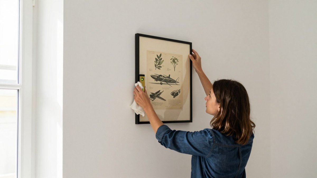
Before you commit, measure the wall and mark it. Cut a paper template at the full size of the print, tape it to the wall with painter's tape, then live with it for a day.
The calming-versus-stimulating question is the one that affects daily life most. A toddler's room must do two jobs: support play in the day and help the child wind down at night. Visual complexity and contrast are the main levers.
A workable approach is zoning. Get expert rules on wall art size, placement and style for any room if you are unsure how to scale pieces to each zone. Divide the room mentally into a sleep zone around the bed and a play zone around the rug, shelves or reading corner. Work through a full room layout designed for a safe, calm nursery to plan both zones together.
It also helps to think about how art is seen from the child's position. A toddler lying in bed looks up at the ceiling and the upper wall, not at the carefully arranged gallery you see when you stand in the doorway.
Watch out: Do not hang the brightest or most stimulating print directly opposite the bed, where it will be the first thing your child sees on waking and the last thing before sleep.
The article gives concrete placement and sizing guidance that is easy to scan:
| Item | Guideline | Note |
|---|---|---|
| Single piece width | About two-thirds of the furniture width below | Lets the furniture set the scale |
| Gap between grouped frames | About two to three inches | Keeps the arrangement visually tight |
| Educational art centre height | Roughly 57 to 60 inches from floor | Near adult eye level; lower for very young children |
| Decorative art above furniture | Bottom edge 6 to 10 inches above furniture top | Connects piece to the furniture |
| Hardware load rating | At least twice the piece's weight | Use two hanging points for larger pieces |
| Bed-to-art clearance | A comfortable arm's length from headboard | Keeps art out of a standing child's reach |
Step 5: Frame, Mount, and Protect Art Safely
Safety is the part most guides skip, and in a toddler room it matters more than almost anything else on this list.
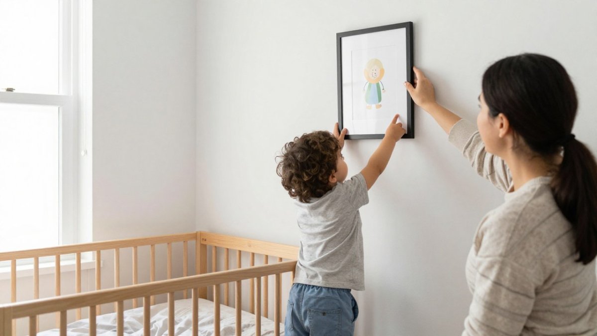
Start with the glazing, because it decides how much damage a fall can do. Standard glass is heavy and shatters into sharp pieces.
Next, look at the frame itself.
Mounting hardware is where many accidents begin. A single nail with a picture hook is fine for a small, light print on plaster or solid wood studs.
Placement is the other half of safety. Keep heavy or glazed art out of the sleep zone where possible.
Think about the height of the piece as well. Keep anything a child can reach at a height where it cannot be easily removed, or choose lightweight frames for the lower zone. Follow our step-by-step guide to hanging nursery art securely before you mount anything in a toddler's room.
Maintenance keeps these safeguards working. Once or twice a year, check that hooks have not loosened, that wire is not fraying, and that the frame sits level and secure.
Finally, weigh the printing method against durability. A home printout on standard paper can look charming, but it fades under daylight, curls at the edges and often lacks archival quality.
Watch out: Never use a sawtooth hanger or a single nail on a frame heavier than a few pounds above a sleep space.
Booking Your Next Step: Shopping for a Piece You Will Keep Through the Teen Years
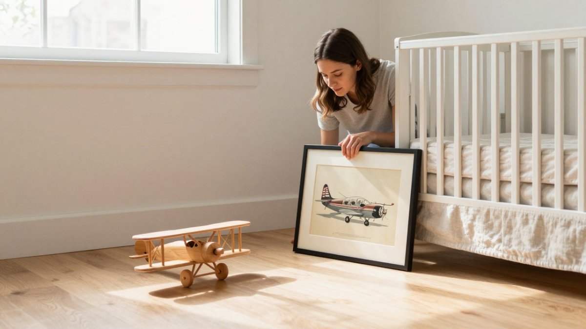
Once you know your palette, your theme and your safe hanging plan, shopping becomes much simpler. Start with a single anchor piece that fits the room's mood. Then look for artwork that shares its colors and subject style, so the room grows without losing its character.
If you want to see how these ideas work in practice, explore the nursery and children's collections at RunwayandHeirloomArt. Our Watercolor Nursery Art selection is a good place to start for soft, calm palettes.
Pick one piece, hang it safely, and let the room tell you what it needs next.
Frequently Asked Questions
What colors work well for a toddler's bedroom?
Soft, neutral-based palettes work best for a toddler's bedroom because they stay calm across years of changing tastes. Warm whites, muted greens, soft blues, and natural wood tones pair easily with timeless artwork. Choose two or three accent colors that repeat across the room, such as a single print color echoed in a rug or pillow. Avoid saturated primaries on every wall, since they tend to date a room quickly and can feel overstimulating at bedtime. A cohesive palette lets you swap individual prints later without redoing the whole space.
Should artwork in a toddler's room be educational or decorative?
Most families do best with a mix. Decorative pieces with calm composition and soft tones create the restful backdrop a toddler bedroom needs. Educational elements such as classic maps, botanical illustrations, or animal studies add learning value and tend to stay relevant as children grow. A practical approach is one or two educational prints as anchor pieces and the rest decorative, so the room feels personal without becoming busy. Children's room wall art ideas that blend both categories usually age the most gracefully.
How do you hang framed art safely in a toddler's bedroom?
Use mounting hardware rated for the frame's weight, and check stud locations before drilling. Hang pieces above the reach of a standing toddler, typically with the lower edge well above crib and bed height, and avoid placing frames directly over a headboard or crib. Choose shatterproof glazing such as acrylic instead of glass, and secure frames with a backing wire or safety clip. Inspect hardware every few months, since toddlers pull, climb, and bump walls. Keep cords and small mounting parts out of reach during installation.
How do I know framed art will last and not fade?
Look for archival-quality inks and acid-free mounting materials, and keep prints out of direct sunlight, which causes the most fading. Shatterproof glazing protects both the print and the room from broken glass. Rotate pieces occasionally so no single print receives constant light exposure. Buying from a provider that discloses print materials and framing options makes it easier to plan for durability. Pricing depends on size, framing, and quantity, so check the current options and quotes directly on the shop's website.