 how-to
Styling Abstract Art in Minimalist Living Spaces
Table of Contents
- Abstract Art Above Sofa Ideas: Anchor Your Seating Area
- How to Hang Abstract Art in a Living Room: Step-by-Step
- Choosing Wall Art for a Neutral Living Room
- Large Abstract Art for Small Living Room: Scale and Proportion
- Lighting and Texture: The Details That Make Abstract Art Work
- Common Mistakes to Avoid When Styling Abstract Art
- Conclusion: Bringing Your Minimalist Space to Life
- Frequently Asked Questions
Last Updated: October 16, 2026
Abstract Art Above Sofa Ideas: Anchor Your Seating Area
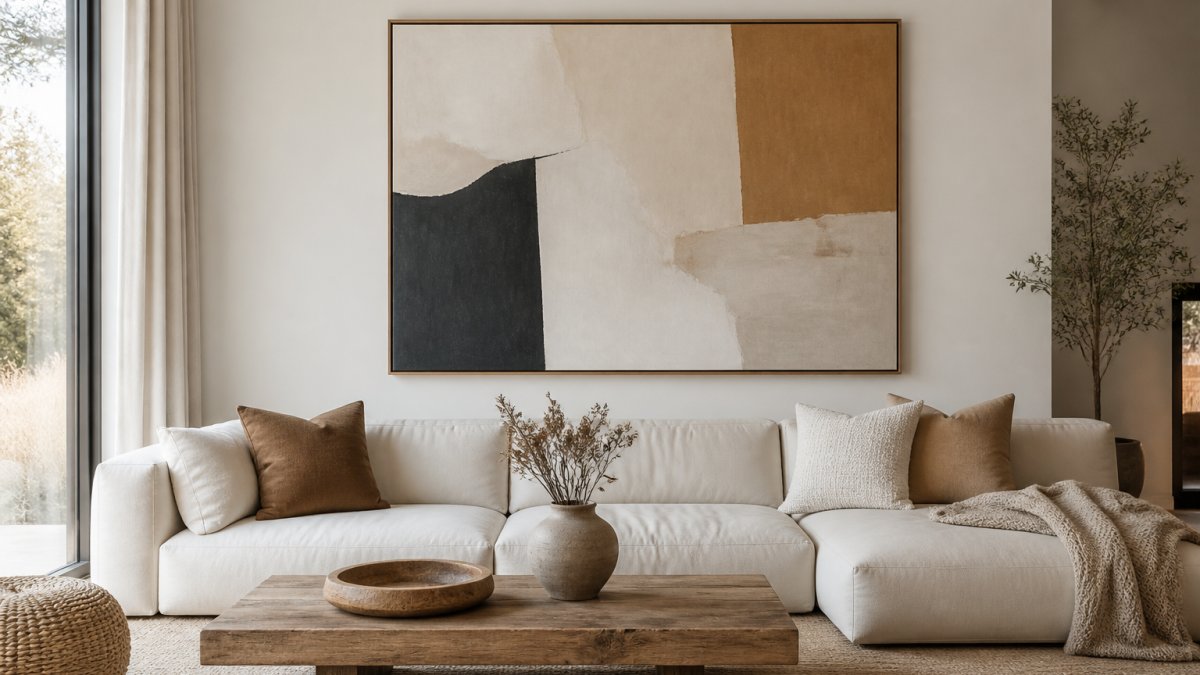
Hanging abstract art above a sofa is the fastest way to anchor a seating area and give a minimalist room a focal point.
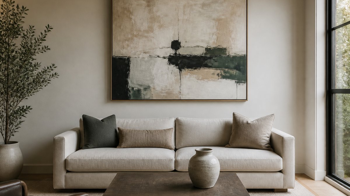
This guide from Runway & Heirloom covers how to hang, size, and light abstract art so it looks intentional rather than accidental.
A common mistake is hanging art too high. Most people do it.
Here is how to anchor the wall:
- Center the art on the sofa, not the wall
- Leave 6 to 10 inches between the sofa back and the bottom of the frame
- Match the art width to about two-thirds of the sofa width
- Keep side tables clear so the art stays the star
A single oversized piece reads calmer than three small ones.
How to Hang Abstract Art in a Living Room: Step-by-Step
Learning how to hang abstract art in a living room comes down to height, spacing, and a level line. Follow these steps and the wall will look deliberate on the first try.
- Mark eye level at 57 to 60 inches from the floor.
- Find the center line of the sofa or wall.
- Tape the frame outline on the wall and step back.
- Mark hardware points on the tape, not the wall.
- Drill, anchor, and hang the piece.
- Check the level and adjust the spacing.
Total time: about 30 minutes for one piece.
What you'll need: a tape measure, painter's tape, a pencil, a level, and wall anchors rated for your frame weight.
For a pair or trio, keep 2 to 4 inches between frames. Wider gaps break the group into separate objects instead of one composition.
Choosing Wall Art for a Neutral Living Room
Choosing wall art for a neutral living room is about contrast and restraint, not color. A neutral room is a gift.
Start with the room's base: warm whites, greys, or beiges. Then decide what the art should do.
- Add quiet texture: soft washes, muted tones, organic forms
- Add energy: high contrast, bold geometric shapes
- Add warmth: earthy rusts, ochres, and deep blues
A restrained color scheme keeps the room calm.
Scale matters more than color here. A small print on a large blank wall looks lost.
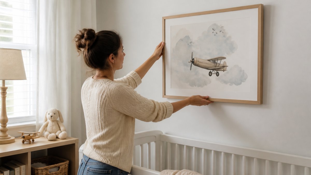
For a neutral nursery or child's room, soft watercolor pieces in gentle tones sit easily against pale walls.
Large Abstract Art for Small Living Room: Scale and Proportion
Large abstract art works in a small living room when it fills the wall without crowding it.
Here is the rule we use: the art should take up 60 to 75 percent of the wall width above the main piece of furniture.
Why does it work? A single large piece creates one strong focal point.
- Choose one oversized print over a cluster of small frames
- Keep the surrounding wall uncluttered
- Use negative space as part of the design
- Match the frame color to the wall for a seamless look
If the ceiling is low, hang the art slightly lower to draw the eye down and out.
Lighting and Texture: The Details That Make Abstract Art Work
Lighting and texture decide whether abstract art looks flat or alive. Most styling guides stop at "hang it near a window." That is not a lighting plan. This section covers the fixtures, angles, and medium-by-medium trade-offs that actually change how a piece reads on a minimalist wall.
Match the fixture to the job
- Picture lights. A hardwired or plug-in picture light mounted 4 to 8 inches above the frame throws light down the face of the canvas. Look for a fixture with a rotatable shade so you can aim the beam at the surface, not the wall behind it. This is the single best upgrade for a textured piece.
- Adjustable track and monorail. Track heads let you aim light from the ceiling at a steep angle across the surface. Use a narrow beam (spot, roughly 10 to 20 degrees) for a single large piece and a wider flood for a grouped composition.
- Wall washers and recessed adjustable cans. A wall washer spreads even light across the whole wall, which suits a large flat print. An adjustable can aimed at the art gives more control but can create a hot spot if it sits too close.
- Floor and table lamps. A lamp placed to the side of the art rakes light across the surface at a low angle. This is the cheapest way to reveal texture without wiring anything.
Aim for a raking angle, not a straight-on blast
Light hitting the art dead-on flattens it. Light hitting it from the side at roughly a 30-degree angle skims the surface and casts tiny shadows across brushstrokes, canvas weave, and paper tooth. That shadow is what makes impasto and mixed media read as three-dimensional.
A common pattern is to place the light source slightly off-center and above, then step back and check for glare. If you can see the bulb reflected in the surface, move the fixture or change its angle.
Color temperature and glare
- Warm light (around 2700K to 3000K) flatters earthy, muted, and warm-toned abstract work and blends with most residential lighting.
- Cooler light (around 3500K to 4000K) can make blues and greys look crisp but can also make warm tones look muddy.
- Keep the art's light in the same family as the room's other fixtures, or the wall will look like it belongs to a different house.
- Glossy surfaces, glass glazing, and acrylic face-mounts reflect light and wash out color. Matte paper, canvas, and unglazed surfaces absorb light and hold color better under a directional beam.
How the medium changes the plan
- Impasto and heavy oil or acrylic. The paint sits proud of the canvas and catches raking light. This is the medium that rewards a picture light or angled track head the most.
- Watercolor and thin washes. The paper texture is subtle, so a soft, even wash of light reads better than a hard beam. Harsh directional light can make the paper look blotchy.
- Mixed media and collage. Raised edges and varied surfaces create their own shadows. Side light exaggerates them; straight-on light hides them.
- Digital and giclée prints. These are usually flat, so the goal is even coverage and glare control rather than texture reveal. A wall washer or a wide flood works better than a spot.
Protect the piece
Direct sunlight fades pigments over time, and ultraviolet light does the most damage. Keep art off walls that take hours of unfiltered afternoon sun, or use UV-filtering glazing and draw sheer curtains during peak hours. Soft, indirect light shows texture without cooking the colors.
Common Mistakes to Avoid When Styling Abstract Art
Most styling problems come from a handful of repeat mistakes. Fix these and the room instantly looks more considered. The list below goes past the usual "don't hang it too high" advice and explains the mechanism behind each error, plus the shape psychology most guides ignore.
Placement and scale mistakes
- Hanging too high. Art centered above roughly 60 inches from the floor disconnects from the furniture below it. The eye reads the wall and the sofa as two separate things instead of one composition.
- Sizing to the wall instead of the furniture. A piece should relate to the sofa or console it sits above, not just the empty wall. Art that is too small for its anchor point looks like a stamp; art that is too large crowds the seating.
- Ignoring the room's proportions. A low ceiling wants art hung slightly lower to pull the eye down. A narrow room wants a wide horizontal piece to stretch the space visually.
Composition mistakes
- Mixing too many frames, styles, and colors at once. A curated group shares at least one trait, frame finish, mat width, or a color thread. A random group reads as noise.
- Crowding the art. Shelves, sconces, and tall plants that overlap the art's edges compete with it. In a minimalist room, the wall around the piece is part of the design.
- Forgetting to center on the furniture. Center the art on the sofa or console, not the wall, unless the wall itself is the focal point.
The mistake almost everyone makes: ignoring shape psychology
Abstract shapes carry emotional weight, and in a minimalist room that weight is amplified because there is little else to look at. Choosing shapes that fight the mood you want is the quietest and most common error.
- Organic and curvilinear forms, soft blobs, flowing lines, rounded washes, read as calm, gentle, and restful. They suit bedrooms, reading corners, and rooms meant to lower the pulse.
- Geometric and hard-edged forms, grids, sharp angles, precise circles and squares, read as energetic, ordered, and intellectual. They suit home offices, entryways, and spaces meant to feel crisp and awake.
- High-contrast compositions create visual tension and draw the eye hard. Low-contrast, tonal compositions recede and let the room stay quiet.
- Dense, busy compositions add energy but can feel restless on a large wall. Sparse compositions with lots of negative space reinforce the minimalist calm.
A practical way to use this: decide the feeling you want first, then pick the shape language that produces it, then let the rest of the decor stay neutral.
The fix for all of them
Step back to the doorway and look at the wall as a whole. If the art feels disconnected, too small, or noisy, remove one element and check again. A curated collection feels calm because every piece earns its place. If you are unsure, take one piece away and see if the wall breathes better.
Conclusion: Bringing Your Minimalist Space to Life
Great minimalist walls are not empty. They are edited. One strong piece, hung at the right height, lit well, and given room to breathe will do more than a dozen small prints ever could.
At Runway & Heirloom, we make artwork meant to become part of a room's story.
When you are ready to find art with personality, explore our collection and choose the piece that speaks to you.
Frequently Asked Questions
What is minimalism in art appreciation?
Minimalism in art appreciation means focusing on essential elements like color, form, and negative space rather than detailed representation. In a minimalist living space, you choose abstract art that complements the room's clean lines and uncluttered feel. Appreciate how a single organic form or restrained color scheme creates visual interest without overwhelming the eye. This approach helps you select pieces that feel intentional and harmonious with your contemporary decor.
Where should you place abstract art in a minimalist living room?
Place abstract art where it naturally draws the eye without competing with other decor. The space above a sofa is a classic focal point. For balance, consider a large piece on a main wall or a smaller accent piece on a side wall. Avoid hanging art too high or in crowded corners. In minimalist rooms, one well-placed abstract work often makes a stronger statement than several small pieces scattered around.
How do you choose abstract art for a neutral living room?
Start by pulling one or two colors from your existing neutral palette, such as soft grays, warm beiges, or muted blues. Look for abstract art with a restrained color scheme and clean edges to maintain the uncluttered aesthetic. Texture can add depth without introducing busy patterns. If you want a subtle focal point, choose a piece with high contrast in a single hue. For a softer look, opt for low-contrast organic forms.
Can colorful abstract art work in a minimalist space?
Yes, colorful abstract art can work beautifully in a minimalist space when used as a deliberate accent. Choose a piece with a limited but bold color palette, such as a single vibrant hue against neutral tones. Let the artwork be the main event by keeping surrounding decor simple. The key is balance: a colorful abstract painting adds energy and personality without making the room feel cluttered if the rest of the space remains uncluttered.