 how-to
Best Art for Nursery Color Palettes: A 2026 Guide
Table of Contents
- Why Art Matters in Nursery Design
- Understanding Color Psychology for Baby Rooms
- Best Art for Nursery Color Palettes: Trending Combinations
- Gender-Neutral Nursery Color Schemes and Art Selection
- How to Style Nursery Gallery Walls with Coordinated Art
- Choosing Art for a Baby's Room: A Step-by-Step Process
- Lighting Impact on Color Perception in Nurseries
- Making Art Choices That Grow With Your Child
- Frequently Asked Questions
Last Updated: August 30, 2026
Why Art Matters in Nursery Design
Artwork is a developmental tool, not mere decoration. The right pieces stimulate visual growth, set emotional tone, and evolve with your child. Newborns see primarily in black, gray, and white, so contrasting colors send strong signals to the brain and aid visual development, according to research from the Smith-Kettlewell Eye Research Institute in San Francisco.
At RunwayandHeirloomArt, we believe nursery art should tell a story, capturing a moment, celebrating a passion, or introducing beauty and imagination. The best art combines thoughtful color selection with pieces that have staying power, growing with your child from infancy through childhood.
Understanding Color Psychology for Baby Rooms
Color shapes how your child feels and learns. Research shows that color can influence mood, attention, learning, and social interactions in children. Warm colors like soft terracotta and gentle ochre create comfort and security. Cool tones like sage green and muted slate blue promote calmness and focus. The key is saturation: softer, muted versions deliver psychological benefits without overstimulation.
Deeper tones like deep blue or charcoal can feel sophisticated and grounding when paired with the right accents and lighting. The problem arises when dark colors dominate without relief. Newborns respond to high-contrast combinations, while older children benefit from more nuanced color relationships. This is why the best art for nursery color palettes often includes both bold contrasts and harmonious blends.
Best Art for Nursery Color Palettes: Trending Combinations
The nursery design landscape has shifted toward "neutral-adjacent" palettes, colors that feel calm but have personality. According to interior design trends tracked by Little Crown Interiors, sage green, dusty pink, muted slate blue, and warm terracotta are replacing monochromatic beige approaches.
Sage Green and Warm Neutrals
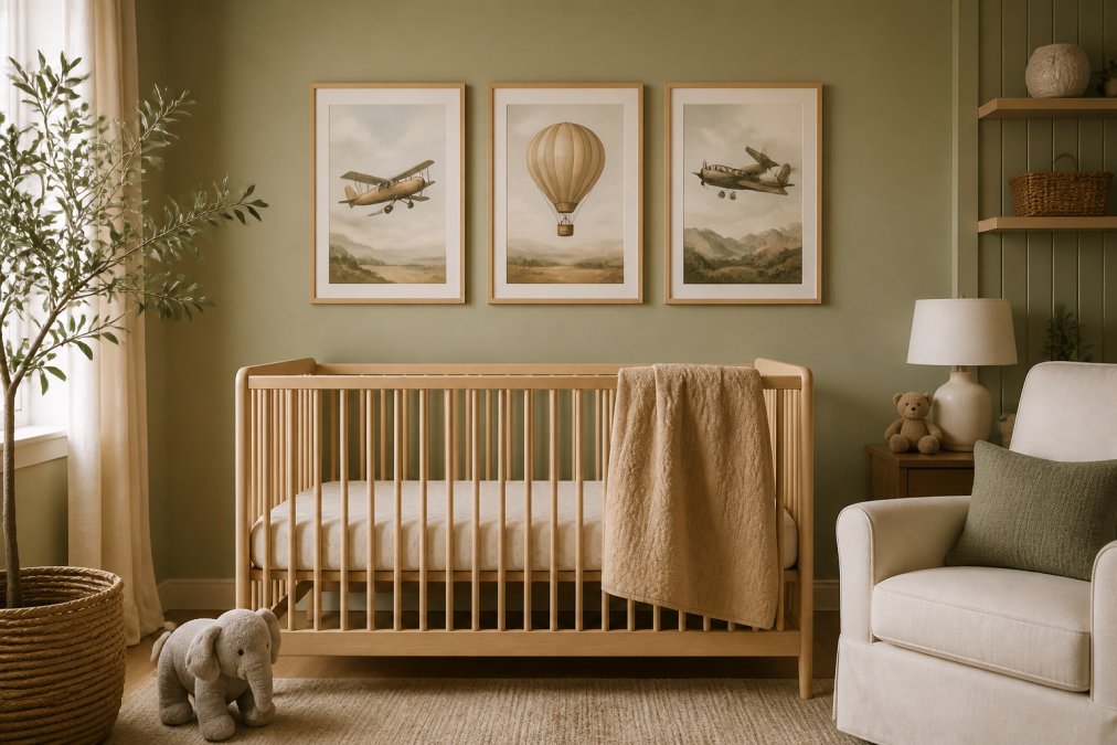
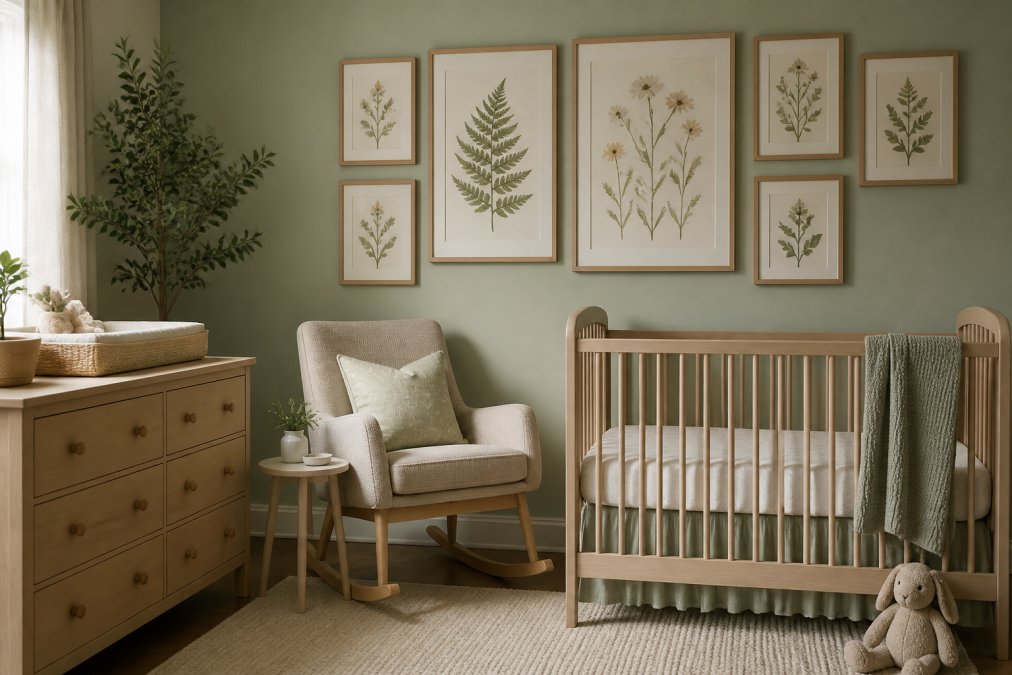
Sage green has become the defining color of modern nurseries. It's calming without being cold, natural without feeling trendy. Pair sage walls with art that includes warm beige, cream, and soft terracotta accents. Botanical prints work beautifully, echoing the green while adding texture and visual interest. Watercolor Nursery Art in soft, muted tones pairs particularly well with sage palettes, creating a cohesive, nature-inspired aesthetic.
Lighting matters significantly. Sage green shifts dramatically depending on whether your room gets warm or cool natural light. In warm morning light, it feels almost golden; in cool northern light, it leans toward gray-green. Evaluate art choices in both morning and evening light before committing.
Soft Pastels with Botanical Prints
Dusty pink, soft lavender, and pale yellow create a gentle, dreamy aesthetic without feeling babyish. Avoid cartoon-style pastels; instead choose sophisticated watercolor prints, botanical illustrations, or nature-inspired pieces with muted color palettes.
Soft pastels are forgiving with art selection because the wall color already does the emotional work. Your art can be more varied in style without clashing.
Slate Blue with Muted Earth Tones
Slate blue pairs beautifully with warm browns, ochres, and soft terracotta accents, creating a sophisticated feel that transitions well into a child's room as they age. Art selections should lean toward abstract pieces, geometric patterns, or nature scenes with earthy undertones.
Gender-Neutral Nursery Color Schemes and Art Selection
Gender-neutral design isn't about avoiding color; it's about choosing color for its own merit. Research shows that gender-neutral environments can significantly reduce gender stereotyping and encourage more diverse social interactions among children.
Select colors you genuinely love, then choose art reflecting themes that matter to your family. Aviation prints, botanical illustrations, or abstract art don't read as gendered. Avoid art relying on gendered color coding; instead focus on pieces with visual depth that invite curiosity regardless of the viewer's gender.
How to Style Nursery Gallery Walls with Coordinated Art
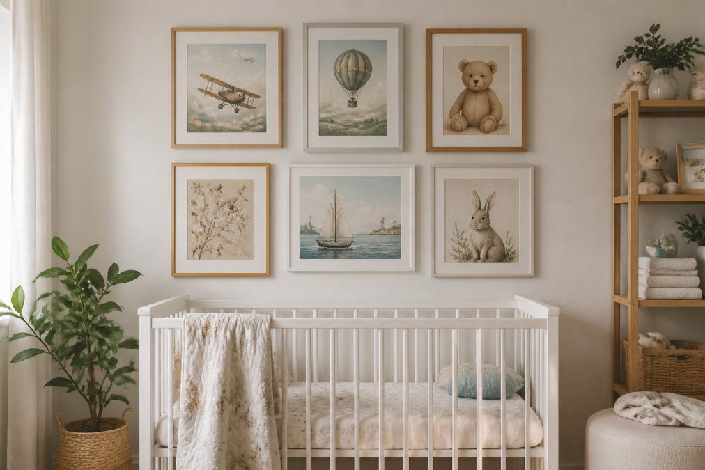
Gallery walls elevate nursery design from decorated room to curated space. Start with a unifying element: consistent frame style, shared color palette, or thematic thread. This lets you mix different pieces without chaos.
Leave 2-3 inches between frames for a modern, gallery-like feel. The best art for nursery color palettes in gallery walls includes 60% pieces echoing your wall color (harmony) and 40% pieces that contrast or complement (visual interest). Vary frame sizes and shapes; a wall of identical frames feels static.
Choosing Art for a Baby's Room: A Step-by-Step Process
Step 1: Assess Your Wall Color and Lighting
Spend a week observing your nursery's lighting. Photograph it in morning, afternoon, and evening light. Hold white paper against the wall to identify warm or cool undertones. This prevents the common mistake of choosing art that clashes in your actual room.
Step 2: Select a Color Palette Theme
Choose 3-5 colors that will appear across your art selections. If your walls are sage green with warm undertones, your palette might be: sage green, warm cream, soft terracotta, and muted gold. Every piece should contain at least two of these colors, ensuring visual cohesion.
Step 3: Choose Art That Complements and Contrasts
Aim for 70% harmony and 30% contrast. Harmony comes from color repetition and thematic consistency; contrast comes from varying style, introducing unexpected color accents, or mixing subject matter. This prevents the wall from feeling one-note.
Step 4: Test Before Committing
Order samples or use return policies generously. For digital downloads, print a test copy, frame it, and live with it for a week. Test your gallery wall layout using paper cutouts before hanging anything.
| Step | Action | Timeline |
|---|---|---|
| Assess | Photograph wall in different lighting, identify undertones | 1 week |
| Select Palette | Choose 3-5 colors that appear in your wall and art | 1 day |
| Choose Art | Select pieces with 70% harmony, 30% contrast | 1-2 weeks |
| Test | Order samples, print tests, live with them | 1-2 weeks |
| Commit | Hang final pieces, step back, enjoy | 1 day |
Lighting Impact on Color Perception in Nurseries
The same sage green wall appears golden in warm morning light and grayish-green under cool afternoon north-facing light. This isn't a problem with your color choices; it's physics.
Warm-toned lighting makes warm colors pop and cool colors recede. Cool-toned lighting does the opposite. If your nursery gets primarily cool, north-facing light, lean toward warmer art colors to compensate. Dimmers are underrated tools, soft, dimmed light makes colors feel more muted and calming, while bright light makes them more saturated and energetic.
Making Art Choices That Grow With Your Child
The best art for nursery color palettes doesn't need replacing when your child turns three. Pieces inspired by art history, vintage aesthetics, and timeless themes work in a nursery and later in a child's room. A watercolor art print isn't babyish; it's beautiful.
Avoid art explicitly tied to infancy like baby animals or nursery rhyme characters, these feel babyish by age four. Instead, choose art with visual sophistication. Sage green and warm neutrals transition beautifully into a big-kid room. Invest in 3-5 statement pieces you genuinely love, then add smaller accent pieces that can change seasonally or as your child's interests evolve.
Choosing the best art for nursery color palettes is about understanding how color shapes development, respecting the light in your space, and selecting pieces with staying power. The nursery design trends of 2026 emphasize sophistication, personality, and thoughtful color coordination. At RunwayandHeirloomArt, we create watercolor prints and art-inspired pieces designed to grow with your child, from nursery through childhood and beyond. Explore our collection of nursery wall art and discover pieces that bring both beauty and intention to your space.
Frequently Asked Questions
Q: What is the best art for nursery color palettes if I want a calming environment?
A: The best art for nursery color palettes combines soft, muted tones with botanical or nature-inspired designs. Watercolor art with gentle botanical prints creates a serene space without overstimulation. Avoid large areas of bright reds or oranges, which can cause hyperactivity in infants and toddlers.
Q: How do I coordinate wall art with my nursery paint color?
A: Start by identifying your wall color's undertones (warm, cool, or neutral). Choose art that either harmonizes with those undertones or provides subtle contrast. For example, if your walls are warm beige, select art featuring sage green or terracotta accents. Test digital previews or printed samples before purchasing to see how colors interact under your specific lighting.
Q: Are gender-neutral nursery color schemes better for visual development?
A: Gender-neutral color schemes don't directly impact visual development, but they do support cognitive and emotional growth. Research indicates that gender-neutral environments reduce stereotyping and encourage diverse social interactions. Color choices matter more: newborns see primarily in black, gray, and white initially, so high-contrast designs support early visual stimulation. As babies grow, softer, harmonious palettes with nature-inspired art support mood regulation and learning better than heavily gendered themes.
Q: How many pieces of art should I include in a nursery gallery wall?
A: A balanced nursery gallery wall typically includes 3 to 7 pieces, depending on wall size and room proportions. Avoid overcrowding, which can overstimulate young children. Space pieces 2 to 3 inches apart for visual breathing room. Group pieces with similar color undertones or design motifs for a cohesive, harmonious look.
This article was written using GrandRanker