 how-to
How to Style Aviation Art Prints: A Complete Guide
Table of Contents
- Understanding Aviation Art Styles and Formats
- Vintage Aviation Wall Art for Home Office Setup
- How to Frame Aviation Prints for Maximum Impact
- Aviation Gallery Wall Ideas and Layouts
- Lighting and Preservation for Aviation Artwork
- Styling Aviation Art with Other Decor Elements
- Common Mistakes to Avoid When Hanging Aviation Art
- Frequently Asked Questions
Last Updated: August 28, 2026
Understanding Aviation Art Styles and Formats
Aviation art comes in many forms, each with distinct visual character and emotional resonance. Understanding the differences between styles helps you make confident choices that feel intentional rather than accidental.
According to Runway & Heirloom Art's 2026 guide on vintage aviation wall art, watercolor biplanes and warbirds have emerged as the most expressive entry point into aviation decor, while technical blueprints serve a completely different purpose in a space. Each style tells a different story and works with different interior contexts.
Watercolor Biplanes and Warbirds
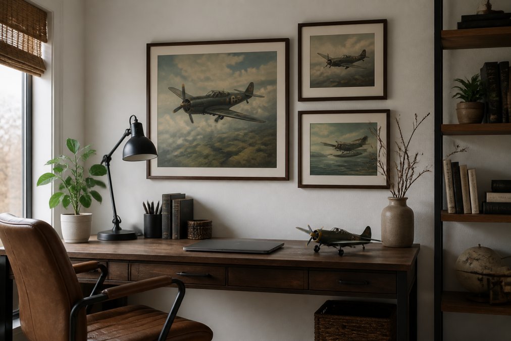
Watercolor aviation prints capture the romance of flight's early era combined with the painterly quality of fine art. These pieces feel timeless because they honor both the historical subject and the artistic medium itself. A watercolor biplane is art, with visible brushwork and color variations that give it character and depth.
These prints work exceptionally well in home offices, studies, and bedrooms because they feel sophisticated without being cold or overly technical. The softer aesthetic of watercolor prevents them from dominating a space, making them ideal if you want aviation art to complement your decor rather than command it entirely. Warbird illustrations carry historical weight and visual drama, particularly effective when you want a statement piece that reflects a genuine passion for aviation history. If you're drawn to this style, Watercolor Art offers a curated selection of pieces in this medium.
Technical Blueprints and Diagrams
Blueprint and technical drawing prints appeal to the engineer's eye and work best in spaces where precision and technical knowledge are valued: home offices, studies, and rooms belonging to aviation professionals or enthusiasts. These pieces celebrate the mechanical beauty of aircraft design through cross-sections, schematics, and technical specifications.
Blueprints work particularly well in minimalist or industrial interiors because their grid-based structure aligns with those design aesthetics. Black metal frames or natural wood frames with white matting are standard choices that let the technical drawings remain the focal point.
Vintage Aviation Posters and Travel Prints
Vintage aviation posters occupy the middle ground between fine art and graphic design. These prints often advertise airlines, aircraft manufacturers, or travel destinations, capturing a specific era when aviation was still novel and glamorous. They feature bold typography, bright colors, and stylized aircraft alongside destinations or promotional messaging.
Travel posters work well in casual spaces like living rooms, guest bedrooms, or family rooms because they feel approachable and nostalgic without formality. According to Buildworld's 2026 home decoration research, 62% of homeowners who chose photography and landscape art preferred pieces that felt connected to a specific place or era, and vintage aviation posters deliver exactly that sense of place and time. For authentic vintage options, Historic Aviation Prints specializes in this category.
Vintage Aviation Wall Art for Home Office Setup
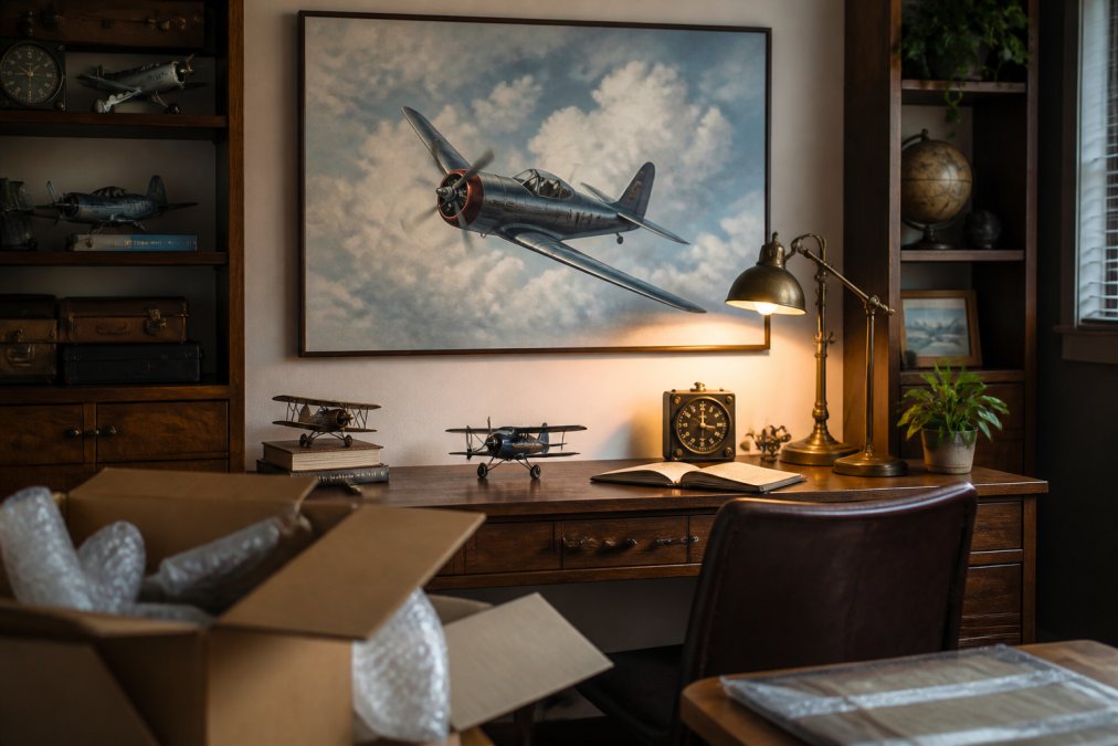
Your home office is where aviation art can work hardest for you. This is the room where you spend focused time, where clients or colleagues may appear on video calls, and where your decor should reflect both professionalism and personality. The challenge is balancing impact with restraint, a home office overwhelmed by aviation art feels more like a museum than a workspace.
Choosing the Right Scale for Your Space
Scale is where most people make their first mistake. They choose aviation prints that are too small for the wall space available, which makes the artwork feel lost and insignificant. Your artwork should occupy roughly 50-75% of the wall space behind your desk. If your wall is 8 feet wide, your art should span roughly 4-6 feet.
A single large-format print (36 inches by 48 inches or larger) almost always works better than multiple small pieces clustered together. For the wall space directly behind your desk, visible on video calls, consider prints at least 24 inches in one dimension. Smaller than that, and the detail gets lost on camera.
Recent 2026 design research from Airpixels confirms that interior designers are increasingly specifying one large, considered piece per wall rather than gallery walls, as a single substantial print commands more attention than multiple smaller frames.
Positioning Art Behind Your Desk
The most common mistake is hanging art too high, which creates visual disconnection between you, your desk, and the artwork. Your eyes should meet the center of the artwork at roughly eye level when you're seated at your desk. Sit at your desk, look straight ahead, and note where your eyes naturally focus. That's where the center of your artwork should be.
If your desk is positioned away from the wall, consider artwork on the wall behind you or to the side, visible to people on video calls but not directly behind your head.
How to Frame Aviation Prints for Maximum Impact
Framing transforms a print into a finished piece of art. Without proper framing, even exceptional aviation artwork can look unfinished or temporary. Quality framing with proper archival materials preserves your artwork for decades, while cheap frames can fade prints within a few years.
Frame Material and Color Selection
The frame material and finish should complement both your aviation print and your room's overall aesthetic. According to Runway & Heirloom Art's 2026 framing guide, specific frame choices work best with different aviation art types: dark walnut or mahogany for warbird illustrations and WWII photography, black metal for blueprints and technical diagrams, and natural oak or light wood for retro travel posters.
For watercolor biplanes, natural wood frames in medium tones or simple metal frames in silver or brushed nickel work well because they don't compete with the artwork's painterly qualities. The frame should enhance without dominating.
Matting and Archival Quality
Matting serves both aesthetic and preservation functions. A mat creates visual breathing room around your print, prevents the artwork from touching the glass, and allows you to adjust the visual proportions of your frame.
Archival matting uses acid-free materials that won't yellow or deteriorate, protecting your artwork from chemical damage. Standard matting from big-box retailers often contains acid that slowly degrades prints. Archival-quality matting costs more upfront but preserves your artwork for decades.
The mat color should either match your frame color or provide subtle contrast. White or cream matting works with almost any aviation print and frame combination.
Aviation Gallery Wall Ideas and Layouts
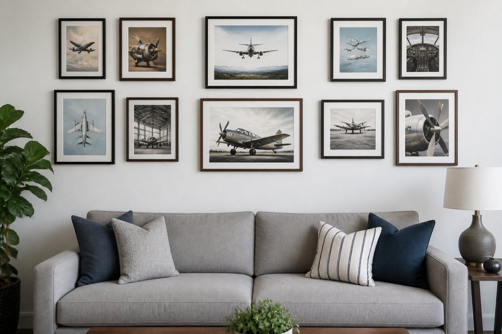
A gallery wall of aviation art can work beautifully if executed with intention. The key difference between a gallery wall that feels curated and one that looks chaotic is planning. You're creating a visual composition where each piece relates to the others through scale, color, frame style, or theme.
Single Statement Piece vs. Gallery Approach
The choice between one large statement piece and a gallery wall depends on your space and your tolerance for visual complexity. A single large aviation print creates calm and focus, anchoring the room with authority and working in almost any interior style. This approach is particularly effective in home offices, bedrooms, or spaces where you want aviation art to be the primary focal point.
A gallery wall works when you have multiple pieces that genuinely belong together. The trend in 2026 is moving decisively toward single statement pieces. Large-format, single prints command attention and feel more sophisticated than gallery walls, which can read as cluttered if not carefully planned.
Spacing and Symmetry Rules
If you choose a gallery wall, consistent spacing between frames, typically 2-3 inches, creates visual rhythm and order. Symmetrical layouts feel more formal and controlled. Asymmetrical layouts feel more relaxed and contemporary. Choose based on your room's aesthetic.
Before hanging anything, lay out your frames on the floor and photograph the arrangement. This lets you see the composition before committing to wall holes.
Lighting and Preservation for Aviation Artwork
Proper lighting transforms how aviation art reads in your space while also protecting it from damage. The goal is illumination that reveals the artwork's details and colors without causing damage.
Direct sunlight fades artwork, particularly watercolor prints, which are especially vulnerable to UV damage. Indirect natural light works well if it's consistent and doesn't include direct sun exposure.
Artificial lighting gives you more control. Picture lights mounted above framed artwork create focused illumination that highlights the piece without spilling light into the room. LED picture lights are ideal because they produce minimal heat and don't emit UV radiation. Warm-white LED lighting (2700K color temperature) complements most aviation art without creating harsh shadows or glare on glass.
Avoid positioning artwork near heat sources which cause temperature fluctuations that damage prints and frames. Ideally, your artwork hangs in a room that stays between 65-75 degrees Fahrenheit with relative humidity around 45-55%.
Styling Aviation Art with Other Decor Elements
Aviation art doesn't exist in isolation. How you integrate it into your broader interior determines whether it feels like a thoughtful design choice or an afterthought. The mistake most people make is treating aviation art as decoration that must match everything else, which creates flat, uninspired rooms.
Color Coordination Without Matchy-Matchy Design
Aviation art should influence your color scheme, not disappear into it. If your watercolor biplane print features warm terracottas and deep blues, those colors can appear elsewhere in your room in throw pillows, a desk chair, or wall color, without the space feeling overly coordinated.
The key is proportion. Let the print be the color statement, and use other pieces to echo specific tones rather than replicate the entire palette. Contrast works better than matching, a warbird illustration in a room with neutral walls and furniture stands out precisely because it isn't coordinated.
Blending Aviation Prints with Modern and Traditional Interiors
Aviation art adapts to different interior styles if you choose the right pieces and frames. Watercolor prints work in traditional, transitional, and contemporary spaces. Technical blueprints suit modern and industrial aesthetics. Vintage travel posters work in eclectic, bohemian, and retro-inspired interiors.
The frame and matting do much of the work integrating the artwork into your style. A warbird illustration in a heavy mahogany frame with cream matting reads traditional. The same print in a thin black metal frame with white matting reads contemporary. In modern interiors, pair aviation art with clean lines, minimal accessories, and neutral backgrounds. In traditional spaces, aviation art can coexist with pattern, texture, and layered accessories.
Common Mistakes to Avoid When Hanging Aviation Art
Understanding what doesn't work is as important as understanding what does. Most hanging mistakes come from either overthinking or under-planning.
According to Liz Lidgett, an art advisor and gallery owner, "The mistake I notice most often is treating art like an afterthought, hung too high, too small for the wall, or isolated without any relationship to the furniture below it. Art should feel anchored in a room, not floating above it."
Hanging art too high leaves pieces feeling disconnected and out of reach. Choosing prints that are too small for your wall space leaves them feeling insignificant. Mixing too many frame styles in a gallery wall creates visual chaos. Isolating aviation art without considering the furniture below it creates disconnection. Neglecting proper framing and matting suggests the artwork isn't worth preserving.
Styling aviation art prints requires understanding both the artwork itself and how it functions within your space. Start with one statement piece that genuinely speaks to you, frame it properly with archival matting, position it at eye level, and let it anchor your room's aesthetic. From there, you can expand thoughtfully, knowing that each addition serves a purpose rather than simply filling wall space.
Frequently Asked Questions
Q: What's the best way to hang aviation art at the correct height?
A: Hang aviation art at eye level, which is typically 57 to 60 inches from the floor to the center of the frame. In home offices, this means positioning pieces so they're visible when seated at your desk. Avoid hanging too high, which makes the art feel disconnected from the room and disrupts the visual flow. For gallery walls, maintain consistent spacing between frames, typically 2 to 3 inches, to create a cohesive, anchored display.
Q: How do I choose between a single large aviation print and a gallery wall?
A: A single large-format print commands more attention and works well in modern spaces or minimalist offices. Gallery walls suit collectors with multiple pieces or rooms with varied architectural features. In 2026, interior designers increasingly favor one considered, large-scale piece per wall over scattered smaller frames. Choose based on your room size, wall space, and how much you want the art to dominate the visual landscape.
Q: What frame style works best for vintage aviation wall art?
A: Frame selection depends on the print's subject and era. Dark walnut or mahogany frames suit warbird illustrations and WWII photography, adding warmth and historical authenticity. Black metal frames work for blueprints and technical diagrams, creating a contemporary edge. Natural oak or light wood frames complement retro travel posters and vintage commercial aviation imagery. Thicker, matted frames are returning as a 2026 decor trend, especially for vintage aviation pieces, adding depth and vintage charm.
Q: How do I ensure aviation prints won't fade or deteriorate over time?
A: Choose giclee prints on archival-quality, museum-grade paper that resists fading and yellowing. Avoid direct sunlight exposure, position art away from windows or use UV-protective glass or acrylic in frames. Proper framing with acid-free matting and backing prevents deterioration. High-resolution imagery printed on quality stock ensures colors remain vibrant for decades, making your aviation art a true heirloom piece.
This article was written using GrandRanker