 how-to
How to Curate an Art Gallery Wall at Home
Last Updated: November 4, 2026
Quick Summary
To curate a gallery wall at home, plan the layout before drilling by taping paper templates to the wall and living with the arrangement for a day or two. Keep gaps consistent at 2 to 3 inches, center the group 57 to 60 inches from the floor, and let the composition fill about two-thirds of the wall space.
- Measure your wall and test paper frame templates before committing to a single nail.
- A gallery wall layout generator previews arrangements, but only if you enter real frame sizes.
- Repeat one frame finish at least twice so a mixed look reads as deliberate.
- Mount a picture light 8 to 12 inches above the frame, angled about 30 degrees down.
- Rotate one or two pieces each season to spread UV exposure evenly across the collection.
Table of Contents
- Step 1: Plan Your Gallery Wall Layout Before You Drill
- Using a Gallery Wall Layout Generator to Test Ideas
- Gallery Wall Rules That Keep a Wall Looking Curated
- Choosing Art With Meaning and a Cohesive Color Palette
- Eclectic Gallery Wall Ideas That Still Feel Balanced
- Mixing Frames, Hardware, and Lighting for a Finished Look
- Keeping Your Gallery Wall Clean and Fade-Free
- Building Your Gallery Wall With Runway & Heirloom Art
- Frequently Asked Questions
Step 1: Plan Your Gallery Wall Layout Before You Drill
A gallery wall is a group of framed artworks arranged as one composition on a single wall, and the difference between a curated wall and a cluttered one comes down to planning. A common mistake is buying frames first and figuring out placement last. Flip that order.
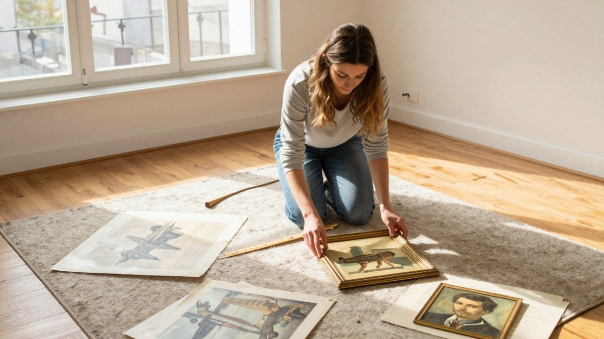
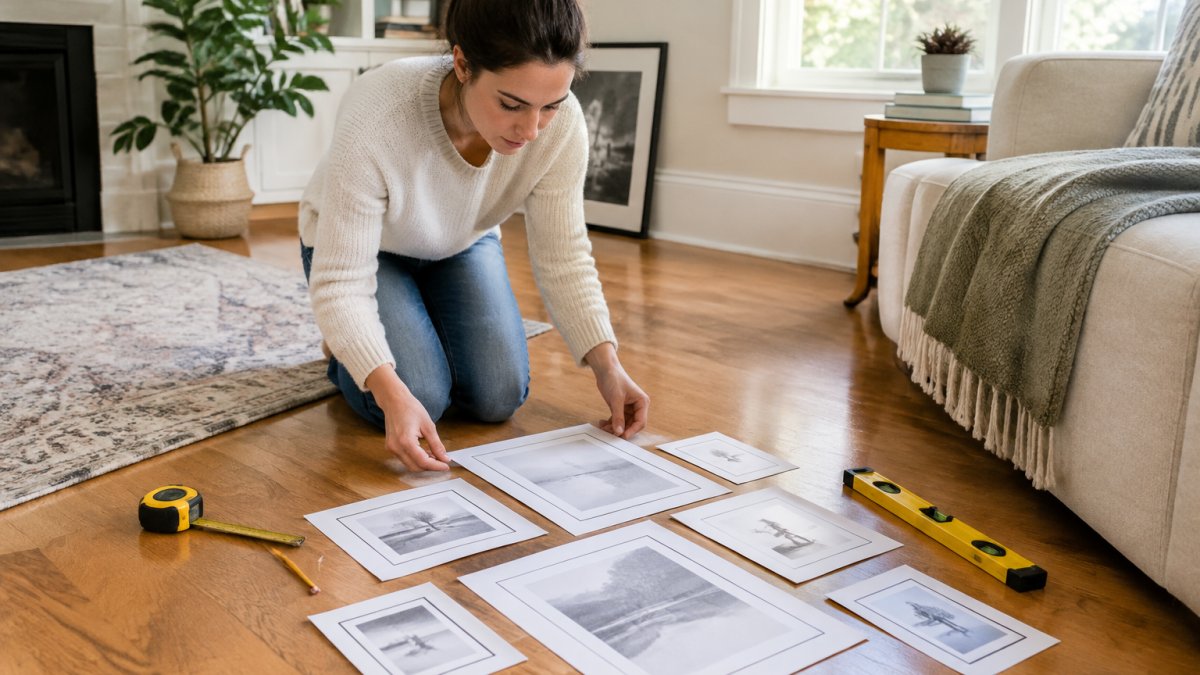
Start by measuring your wall's width and height. Then cut paper templates for every frame you plan to hang. Tape them up and live with the arrangement for a day or two before you commit to a single nail.
Map the Arrangement With Paper Templates
Paper templates let you test visual balance without patching holes. Trace each frame onto kraft paper, cut it out, and mark the hanging point on the paper itself. Tape the shapes to the wall at your planned heights.
Step back. Move things. This is the cheap stage, so use it. For a deeper walkthrough of spacing rules and no-nail options, our guide on how to arrange a gallery wall covers the full process from start to finish.
Using a Gallery Wall Layout Generator to Test Ideas
A gallery wall layout generator is a digital tool that arranges frame shapes to scale so you can preview a composition before hanging anything. Most let you upload wall dimensions, drag in frame sizes, and swap between grid and organic layouts.
The catch: generators are only as good as your measurements. Enter real frame sizes, not guesses, or the preview lies to you. We suggest using a generator for the rough arrangement, then paper templates for the final check. The screen gets you close; the wall gets you exact.
Gallery Wall Rules That Keep a Wall Looking Curated
Three rules do most of the work: consistent spacing, a sensible center height, and a clear focal point. Everything else is personal taste layered on top.
Spacing, Eye Level, and the 2/3 Rule
Keep gaps between frames consistent, usually 2 to 3 inches, so the group reads as one unit.
The 2/3 rule matters just as much: your gallery should fill about two-thirds of the wall space it occupies, not the whole thing. Negative space is what makes a composition feel intentional rather than crowded.
- Consistent gaps: 2 to 3 inches between every frame
- Center height: 57 to 60 inches from the floor
- Fill ratio: about two-thirds of the available wall area
- Anchor piece: one larger work that the rest responds to
Choosing Art With Meaning and a Cohesive Color Palette
Pick art you actually want to look at every day, then let color tie it together. A cohesive gallery wall usually shares one thread: a repeated hue, a common era, or a subject that runs through every piece.
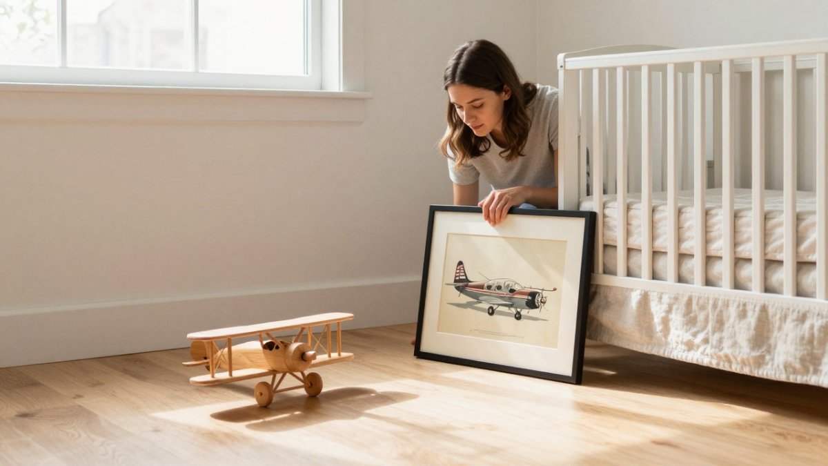
That thread can be loose. A nursery wall might pair soft Watercolor Nursery Art with one bolder print for contrast. A study might mix Historic Aviation Prints with an Art Deco print, united by warm amber tones. Our guide on choosing wall art for every room breaks down size, placement, and style rules room by room.
Eclectic Gallery Wall Ideas That Still Feel Balanced
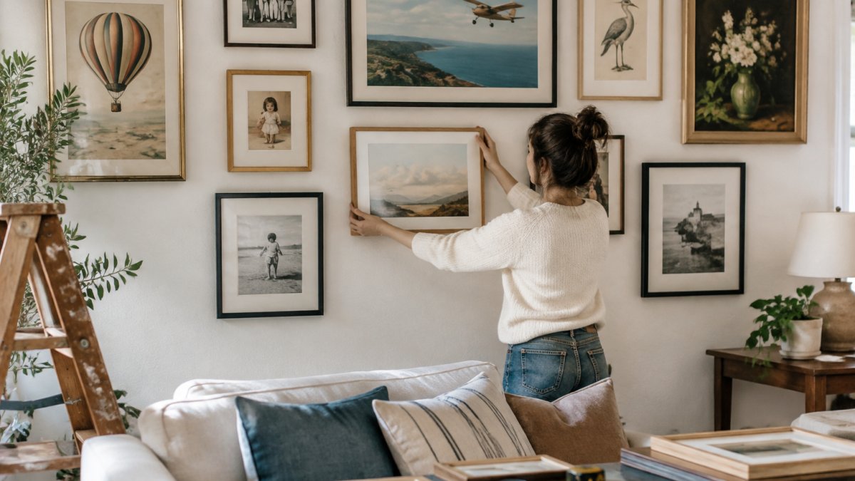
Eclectic does not mean random. The trick is to vary frame sizes, shapes, and subjects while holding one element steady, usually color or spacing.
Try mixing a large anchor piece with smaller works clustered around it. Vary frame finishes but repeat at least one material. Keep the gaps identical even when the frames are not. For a step-by-step example of a story-driven arrangement, see how to build a nostalgic gallery wall.
Mixing Frames, Hardware, and Lighting for a Finished Look
Frame coordination is where most walls either sing or sag. You have two solid options: match all frames for a clean, minimalist look, or mix finishes deliberately, pairing, say, black and natural wood. A safe pattern most designers use is to repeat one finish at least twice so the mix reads as a decision rather than an accident.
Hardware matters more than people expect. Match the hook to the wall: a conventional picture hook for drywall with a stud behind it, a self-drilling drywall anchor for hollow spots, and a sleeve anchor or masonry screw for brick and plaster. A common pattern is to over-buy one hook size up from the frame's weight rating, a 20-pound frame on a 30-pound hook leaves margin for error. Check every frame with a spirit level after hanging; small tilts read as sloppy from across the room.
Lighting a Gallery Wall Without Glare
This is the step most guides skip, and it is the one that separates a finished wall from a flat one. The goal is to light the art, not the glass. A picture light mounted 8 to 12 inches above the top of the frame and angled down at roughly 30 degrees throws light across the surface while pushing reflection below the viewer's eye line. For a multi-frame composition, a single 24- to 36-inch picture light centered over the group usually reads more cohesive than one small light per frame.
If you are using ceiling fixtures, aim for an adjustable or gimbaled spot rather than a fixed downlight, and keep the beam off the glass. A common pattern is to place two angled spots at roughly 30 degrees from the wall on either side of the arrangement so the light rakes across the frames instead of bouncing straight back at you. For color accuracy, look for a bulb in the 2700K to 3000K range with a high color rendering index; most practitioners find that a CRI of 90 or above keeps warm amber prints and cool watercolors reading true instead of muddy.
Watch out: a picture light that sits too close to the frame or points too steeply will put a hot spot on the glass and wash out the top of the artwork, test the angle at night before you commit to the mounting height.
Getting frame proportions right first makes this step far easier, and our guide on choosing frame size for wall art covers standard sizes and measuring tips.
| Element | What to Do | Why It Matters |
|---|---|---|
| Frame finish | Match all, or mix two deliberately and repeat one twice | Prevents a random look |
| Hardware | Correct hook per wall type, one size up from frame weight | Keeps frames level and safe |
| Picture light | 8-12 in. above frame, angled ~30 degrees down | Cuts glare, truer color |
| Bulb | 2700K-3000K, CRI 90+ | Keeps warm and cool art reading true |
| Leveling | Check every frame with a spirit level | Small tilts read as sloppy |
Keeping Your Gallery Wall Clean and Fade-Free
A gallery wall is not a hang-it-and-forget-it project. Dust, sunlight, and humidity all work on framed art slowly, and the maintenance routine most guides never mention is what keeps a wall looking curated five years in rather than five months in.
Dusting and Cleaning Frames
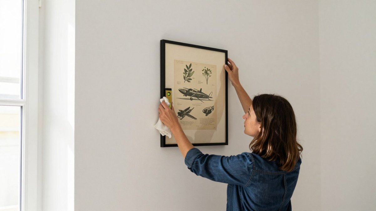
Dust frames with a dry microfiber cloth, never a wet one, and work top to bottom so you are not pushing debris onto clean glass. For glass, a microfiber cloth alone handles most dust; if you need a cleaner, spray it onto the cloth rather than the glass so liquid cannot wick behind the frame and stain the mat. Avoid ammonia-based glass cleaners on acrylic glazing, most practitioners find they cloud the surface over time. Vacuum the tops of frames and the wall above them with a brush attachment every few months, since dust settles on the ledge and then drifts down onto the art.
Preventing Fade and Rotating Art
UV light can gradually fade prints, so placement away from direct sunlight helps protect them. Keep art out of direct sunlight and away from the blast of a heating or cooling vent, which dries and warps paper over time.
A practical rotation schedule is once a season: swap one or two pieces from a bright wall to a shadier one, and move the shadier pieces into the light. This spreads UV exposure evenly across the collection instead of bleaching the same three prints year after year. If a piece sits in a bright room, rotate it seasonally or move it to a shadier wall.
Watch out: hanging art directly above a radiator, fireplace, or forced-air vent is one of the most common causes of warped and yellowed paper, the heat and dry air do more damage than light alone.
Our guide on how to frame art for longevity explains archival mounting and glazing in detail.
Building Your Gallery Wall With Runway & Heirloom Art
The best gallery walls start with art that means something to you. At Runway & Heirloom, our prints are chosen to carry a story, whether that is a watercolor nursery piece, a historic aviation print, or an Art Deco design that recalls another era.
We built our collection around personality rather than a single theme, so you can mix eras and subjects and still end up with a wall that feels like one person's taste. Browse the collection, pick the pieces that speak to you, and plan the layout from there.
Frequently Asked Questions
How do you make a gallery wall look curated rather than cluttered?
Start with one anchor piece and build outward, keeping gaps between frames consistent at 2 to 3 inches. Limit the palette to two or three colors and repeat one material, such as wood or brass, across frames. A curated gallery wall also has breathing room: leave at least 6 to 8 inches between the arrangement and nearby furniture or corners so the composition reads as a single unit rather than scattered decor.
What is the 2/3 rule for wall art?
The 2/3 rule says art should fill roughly two-thirds of the wall width above a piece of furniture, such as a sofa or console. If your sofa is 84 inches wide, aim for an arrangement about 56 inches across. This proportion keeps the gallery wall from looking lost on a large wall or crowded on a small one, and it applies whether you hang a single statement piece or a grid of frames.
What is the best way to plan a gallery wall layout before drilling holes?
Cut paper templates to the exact size of each frame, tape them to the wall, and step back to check balance before any drilling. A gallery wall layout generator can speed this up by letting you drag frame sizes into a grid, salon, or asymmetric arrangement and preview spacing. Mark hanger positions on the templates, confirm heights with a level, then drill through the paper.
How do you balance different art styles on one gallery wall?
Pick a unifying thread first, such as a shared color, frame finish, or subject like aviation or nursery watercolor, then let styles vary around it. Distribute visual weight by pairing a large piece with two or three smaller ones opposite it. Keep spacing uniform even when frames differ, and avoid placing every dark or busy piece on one side, which tips the arrangement and makes an eclectic gallery wall feel unbalanced.
A gallery wall rewards patience more than budget. Measure first, test with templates, and choose art you will still love in five years. Runway & Heirloom can help you find pieces with real character, from watercolor nursery art to historic aviation prints, each made to anchor a wall and start a conversation. Get started with Runway & Heirloom and build a gallery wall that tells your story.