 how-to
How to Spot High Quality Prints: A 2026 Guide
Table of Contents
- What Makes a High Quality Print
- Check Resolution and DPI Requirements
- Evaluate Paper Weight and Finish for Art Prints
- Pigment-Based vs Dye-Based Ink: Which Lasts Longer
- Assess Color Accuracy and Color Profiles
- Giclée vs Digital Print: Understanding the Difference
- How to Frame Art for Longevity and Preservation
- Physical Inspection: What to Look and Feel For
- Frequently Asked Questions
Last Updated: September 3, 2026
What Makes a High Quality Print
A high quality print combines technical precision with materials engineered for longevity. It's not just about what the image looks like today, it's about whether that image will still captivate you in five years, ten years, or longer. The difference between a print that fades and one that endures often comes down to decisions made before the ink ever touched the paper.
The art reproduction market has grown substantially, with Fortune Business Insights reporting that the global market reached USD 50.62 billion in 2025 and is projected to grow to USD 89.78 billion by 2034. This growth reflects a broader shift: collectors and homeowners increasingly recognize that quality matters. You're not just buying decoration, you're investing in something meant to become part of your space's story.
At Runway & Heirloom Art, we've curated prints specifically designed to meet these standards. Whether you're selecting aviation artwork, nursery prints, or art-history-inspired pieces, understanding what separates a quality print from a mediocre one is essential.
Check Resolution and DPI Requirements
Resolution determines whether your print will look crisp or pixelated. The minimum recommended resolution for printing is 300 DPI (dots per inch), according to Oppaca's analysis of common print file errors. Below this threshold, individual pixels become visible, and the image loses detail and sharpness.
DPI measures how many dots of color the printer places within each inch of the print. Higher DPI means more dots, finer detail, and smoother gradations between colors. For most home and gallery prints, 300 DPI is the standard benchmark. Professional fine art printing sometimes uses 360 or even 600 DPI, but the improvement becomes negligible to the human eye beyond 300 DPI for typical viewing distances.
The relationship between your source file and the print size matters critically. A high-resolution file doesn't automatically translate to quality if you're enlarging it dramatically. A 300 DPI image at 8x10 inches will look sharp. That same file enlarged to 24x36 inches will show visible pixelation. The resolution must scale with the print dimensions, larger prints require either higher-resolution source files or smaller enlargements.
When evaluating prints, ask for the source file resolution. Reputable print providers will disclose this. If they won't, that's a warning sign. Quality printers understand that resolution transparency builds confidence.
:::pro Request prints at their native resolution rather than upscaled versions. Upscaling artificially inflates file dimensions without adding real detail. A 150 DPI file enlarged to 300 DPI through software interpolation looks softer than a native 300 DPI capture. :::
Evaluate Paper Weight and Finish for Art Prints
Understanding GSM and Paper Grade
Paper weight fundamentally affects how a print feels and performs. Measured in GSM (Grams per Square Meter), paper weight indicates density and durability. Prints below 200 GSM are considered lightweight and budget-grade, more prone to wrinkling and fading, according to African American Expressions' guide to evaluating canvas print quality. Quality canvas prints typically range from 280-400 GSM.
Premium archival canvas often exceeds 350 GSM, providing superior durability and a professional appearance. This weight difference isn't subtle, it's tangible. Hold a 150 GSM print next to a 350 GSM print, and you'll immediately sense the difference. The heavier stock feels substantial, resists creasing, and conveys quality through touch alone.
For fine art prints on paper, 250-310 GSM is standard. For canvas, 280-400 GSM is the quality range. Below these thresholds, you're compromising on longevity and professional appearance.
Matte, Glossy, and Luster Finishes
Finish type affects both aesthetics and preservation. Matte finishes scatter light evenly across the surface, minimizing glare and creating a sophisticated, museum-quality appearance. They're ideal for detailed artwork where you want viewers to focus on the image rather than reflections.
Glossy finishes reflect light, creating vibrant color saturation and contrast. Colors appear more vivid on glossy paper, but reflections can distract viewers. Glossy finishes also show fingerprints and dust more readily.
Luster finishes split the difference, they offer enhanced color vibrancy without the glare of full gloss. Luster is often the sweet spot for prints displayed in living spaces, offering visual impact without the downsides of either extreme.
For archival longevity, matte finishes on acid-free, cotton rag papers are the gold standard. These combinations resist yellowing and maintain image integrity for decades.
Pigment-Based vs Dye-Based Ink: Which Lasts Longer
This distinction determines whether your print will look identical in ten years or noticeably faded. Pigment-based inks use solid particles suspended in liquid, while dye-based inks dissolve completely into the carrier fluid.
Pigment-based prints using systems like Epson UltraChrome and Canon LUCIA, when printed on acid-free, cotton rag papers, can last 200 to 400 years under proper storage or framed display conditions, according to Wilhelm Imaging Research's comparison of archival inkjet print qualities. This longevity rivals or exceeds traditional silver gelatin prints.
Dye-based inks fade faster because they're more susceptible to light exposure and atmospheric ozone. They offer richer color saturation initially, but that advantage diminishes as the dyes degrade. For prints meant to last, pigment-based inks are the clear choice.
Quality print providers specify their ink chemistry. If they won't disclose whether they use pigment or dye-based inks, assume dye-based. Transparency here indicates confidence in longevity.
Assess Color Accuracy and Color Profiles
Color accuracy separates professional-grade prints from amateur reproductions. Online color accuracy remains a major challenge in the industry, with most online canvas prints showing inaccurate colors due to uncalibrated printing processes. High-resolution source files can compensate for some color shift, but calibration is essential.
Color profiles, standardized color spaces like sRGB and Adobe RGB, ensure that the colors you see on screen match the colors in the final print. sRGB is the standard for web and consumer printing, while Adobe RGB offers a wider color gamut for professional work.
A quality printer uses ICC profiles specific to their equipment and paper combinations. These profiles account for how their particular printers render color on their specific papers. Without proper profiling, even excellent source files produce mediocre results.
When ordering prints, ask about their color management process. Do they soft proof files before printing? Do they use calibrated monitors? Do they offer color correction? These questions reveal whether a provider treats color seriously.
For critical work, artwork you're commissioning or purchasing as an investment, request a proof or sample print before committing to larger quantities. This eliminates surprises and ensures the final product matches your expectations.
Giclée vs Digital Print: Understanding the Difference
Giclée printing uses inkjet technology to produce fine art prints, but not all inkjet prints are giclée. The term specifically refers to high-resolution, high-quality inkjet printing on archival substrates using pigment-based inks. It's a standard in fine art reproduction, particularly for limited editions and gallery-quality prints.
Digital printing is broader, it encompasses any printing method that transfers digital files directly to substrate without plates or screens. This includes giclée but also lower-quality inkjet and other digital methods.
The distinction matters because "digital print" can mean anything from a $2 poster to a $200 fine art reproduction. Giclée carries specific quality expectations: archival materials, pigment inks, careful color management, and limited edition runs.
When shopping for prints, look for "giclée" specifically if you want assurance of quality standards. At Runway & Heirloom Art, our watercolor art and oil painting prints are created with these standards in mind, ensuring prints that combine artistic integrity with lasting durability.
How to Frame Art for Longevity and Preservation
Framing is where most people inadvertently damage prints. Poor framing choices accelerate fading, yellowing, and physical degradation.
Use acid-free matting and backing. Acidic materials chemically attack the print, causing yellowing and brittleness over time. Acid-free conservation board costs slightly more but extends print life by decades.
Avoid direct contact between the print and glass. Use spacers or matting to create air circulation. Direct contact traps moisture, promoting mold and degradation.
UV-protective glass blocks ultraviolet light, which is the primary cause of fading. Standard glass offers no UV protection. UV-protective glass costs more but is essential for prints displayed in sunlit rooms.
Frame placement matters. Avoid direct sunlight, which accelerates fading regardless of ink quality. Indirect natural light or artificial lighting is ideal. If a print must be in a sunny room, UV-protective glass becomes non-negotiable.
Humidity and temperature stability matter more than absolute values. Fluctuating conditions cause expansion and contraction, stressing the print and matting. Maintain moderate, stable conditions, ideally 45-55% relative humidity and 65-75°F.
:::pro Archival-quality framing supplies cost 20-40% more than standard options but extend print life by 50+ years. For prints you intend to keep and display long-term, this investment pays dividends. For temporary displays, standard framing is adequate. :::
Physical Inspection: What to Look and Feel For
Before committing to a print, inspect it physically. This is where many online shoppers fail, they judge quality entirely on screen, then are disappointed when the physical product arrives.
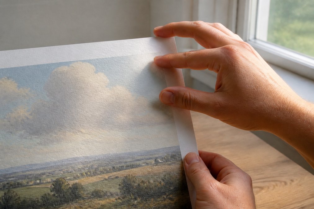
Feel the paper weight. Quality prints have substance, they don't feel flimsy or thin. Run your fingers across the surface. Quality finishes feel smooth and intentional, not rough or uneven. Matte finishes should feel velvety, not gritty.
Examine the edges. Poorly cut prints have ragged or uneven edges. Quality prints are cut precisely with clean, sharp borders. Look at the corners, they should be square and crisp, not rounded or damaged.
Check for color consistency. Scan the entire print for banding (visible horizontal lines where color shifts abruptly) or blotchy areas. Quality prints have smooth color gradations and even saturation throughout.
Look for dust or debris embedded in the finish. This indicates poor quality control during printing or storage. Specks suggest the print wasn't handled carefully before shipping.
Examine the whites and neutrals. These reveal color accuracy issues most clearly. Whites should be clean and bright, not yellowed or tinted. Neutral grays should appear neutral, not shifted toward blue or brown. If the whites look off, the entire color palette is likely compromised.
For canvas prints, examine the wrap. The image should wrap evenly around the sides. Poor wrapping shows inconsistent color or misaligned imagery on the edges.
Test the finish durability. Gently run your finger across the surface. Quality finishes don't smudge or transfer ink to your skin. If the print marks easily, the finish is inadequate.
| Inspection Point | What to Look For | What It Indicates |
|---|---|---|
| Paper weight | Substantial feel, no flimsy texture | Durability and longevity |
| Surface finish | Smooth, even texture | Quality control and archival standards |
| Edge quality | Clean, crisp, precisely cut | Professional handling and standards |
| Color consistency | Smooth gradations, no banding | Proper calibration and printing |
| Whites and neutrals | Clean, unshifted color | Accurate color management |
| Finish durability | No smudging or transfer | Protective coating quality |
Selecting high quality prints requires understanding the technical foundations, resolution, paper, ink, and color management, combined with hands-on inspection. The prints you choose today become part of your home's character. At Runway & Heirloom Art, we've designed our collection with these standards as non-negotiable. Whether you're drawn to our historic aviation prints, watercolor nursery art, or art-history-inspired pieces, each print is created to endure. Discover prints that combine artistic vision with archival integrity, and invest in artwork that tells your story for decades to come.
Frequently Asked Questions
Q: How can you tell if an art print is high quality?
A: High quality prints combine several markers: resolution of at least 300 DPI, pigment-based inks on acid-free paper, paper weight between 280-400 GSM, and accurate color reproduction. Examine the print physically for sharp detail, consistent color, and smooth texture. Prints made with archival-grade materials and proper color profiles will maintain their appearance for decades under standard display conditions, whereas budget prints below 200 GSM tend to wrinkle and fade quickly.
Q: What is the difference between a digital print and a giclée print?
A: Digital prints use standard inkjet technology and are often mass-produced with minimal customization. Giclée prints employ high-end inkjet systems with pigment-based inks on fine art papers, offering superior color accuracy, archival longevity, and tonal range. The distinction matters if you want prints that function as heirlooms rather than temporary decor.
Q: Does paper weight matter when buying art prints?
A: Yes, significantly. Paper weight measured in GSM (grams per square meter) directly affects durability and feel. Prints below 200 GSM are considered lightweight and budget-grade, prone to wrinkling and fading. Quality canvas and fine art prints typically range from 280-400 GSM, with premium archival canvas exceeding 350 GSM. Heavier paper provides superior durability, a more professional appearance, and better resistance to damage during handling and framing.
Q: Why does archival ink matter for long-term art display?
A: Archival inks, particularly pigment-based formulations like Epson UltraChrome and Canon LUCIA, resist fading, yellowing, and ozone exposure far better than dye-based alternatives. When paired with acid-free, cotton rag papers, pigment-based prints can last for decades under proper storage or framed display. Dye-based inks fade much faster and may yellow over time, especially on papers containing optical brighteners. If you want prints that remain vibrant for decades, archival pigment-based inks are essential.
This article was written using GrandRanker